Project Description
UX Design and Research for a Medical College
Institute for Healthcare Delivery Design
This project was initiated by the Institute for Healthcare Delivery Design to conceptualize a digital platform for the College of Medicine at UIC. The platform provides analytics, dashboards, and a feedback messaging system for faculty, students, clerkship directors, and academic advisors across decentralized campuses.

Wireframes (UX Design)
Conceptualizing a centralized digital platform for a College of Medicine.
PROBLEM
Where data exists for curricular performance, it’s sparse and offers little-to-no helpful analytics for directors and faculty. There’s no way to gain insight for improving courses, labs, or clinical rotations. Similarly, there are weak digital tools for collecting faculty feedback and seeing progress for students. These problems are heightened by the decentralization of the College’s three different campuses, each with differing digital platforms.
SOLUTION
After design researchers had gathered user information to identify “problems,” I created wireframes for a central platform. Representing screens for five user groups, they provide better analytics, mobile feedback messaging, and curriculum planning.
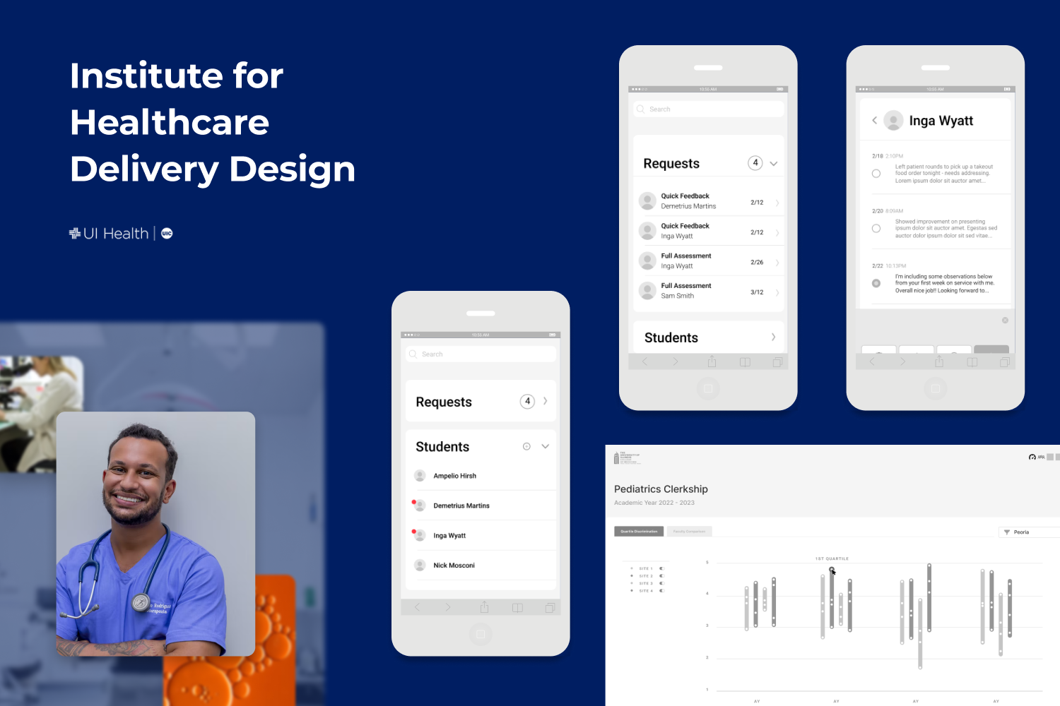
Opportunities arise to solve data solutions across the classroom Blocks, clerkships (i.e. clinical rotations), exams, and even administrative offices overseeing curricular performance.
Let’s start with the clerkships…
Challenge: How do we make it easier for faculty to give real-time feedback to students who are performing their clerkships in clinics?
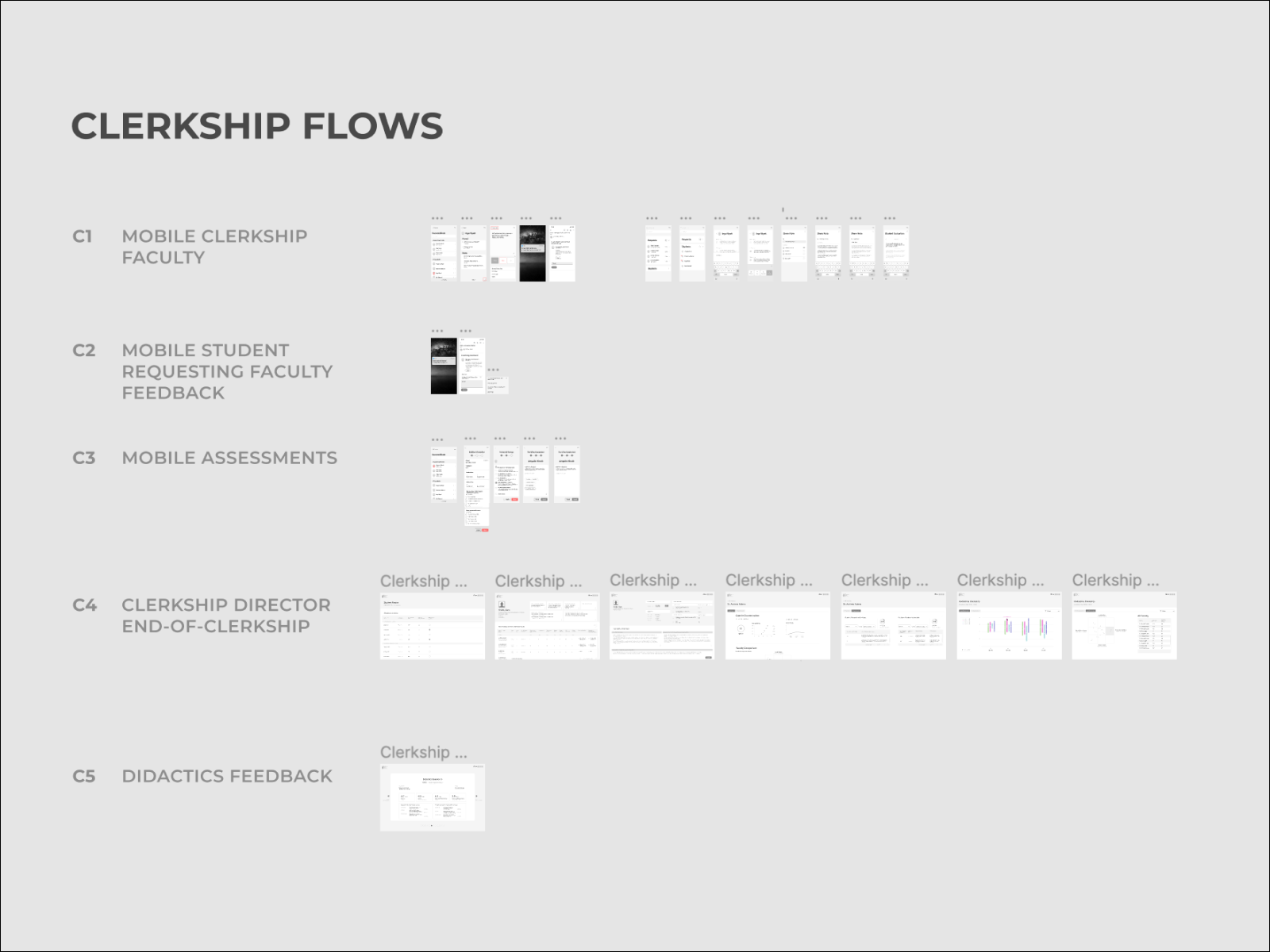
Below are sample wireframes for a mobile feedback system between faculty and students.
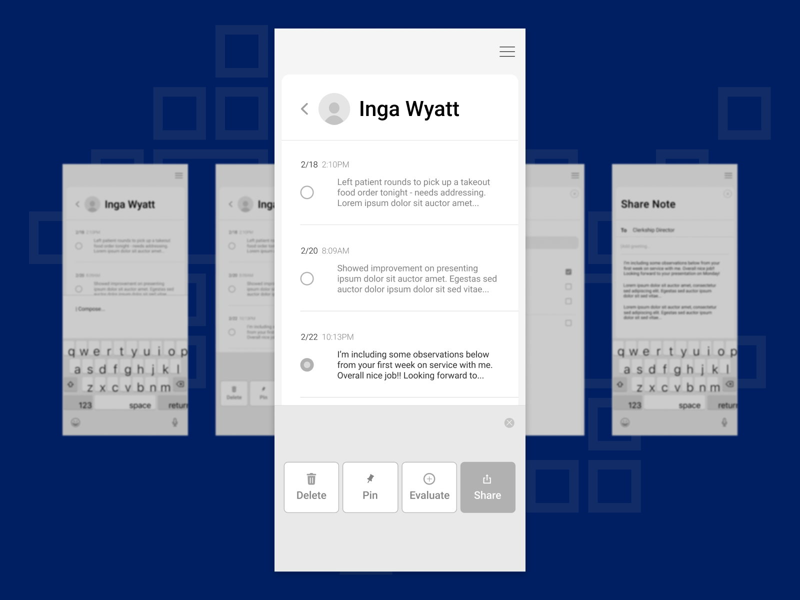
The first few screens for the faculty user group used on-site at clinical rotations: a faculty can easily take notes on student performance in the clinic. (These may have previously been done on desktop only, or possibly pen and paper.)
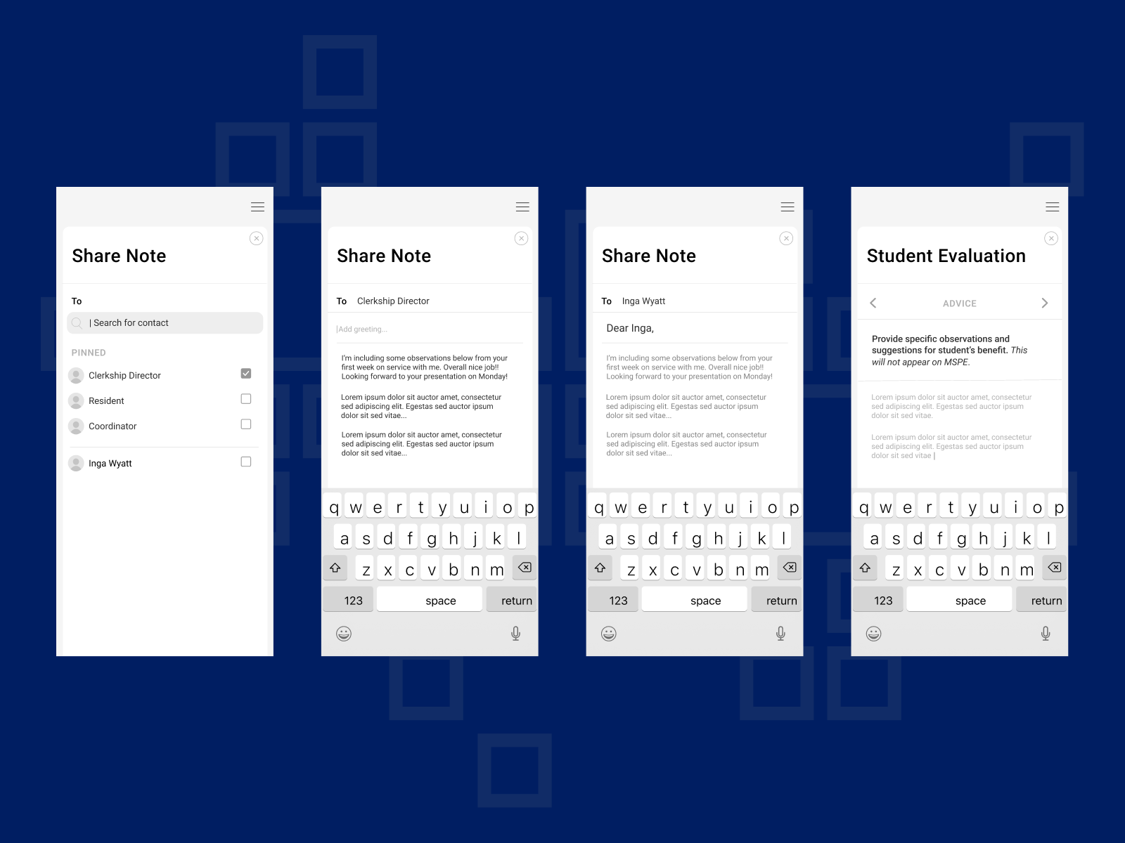
As the faculty member gathers notes on student progress, they can look back to find the most relevant ones, as the clerkship progresses. From here, they can choose to share the note with the student and/or clerkship director.
Zooming out to touch on other pain points in clerkship data, I and the team created more flows.
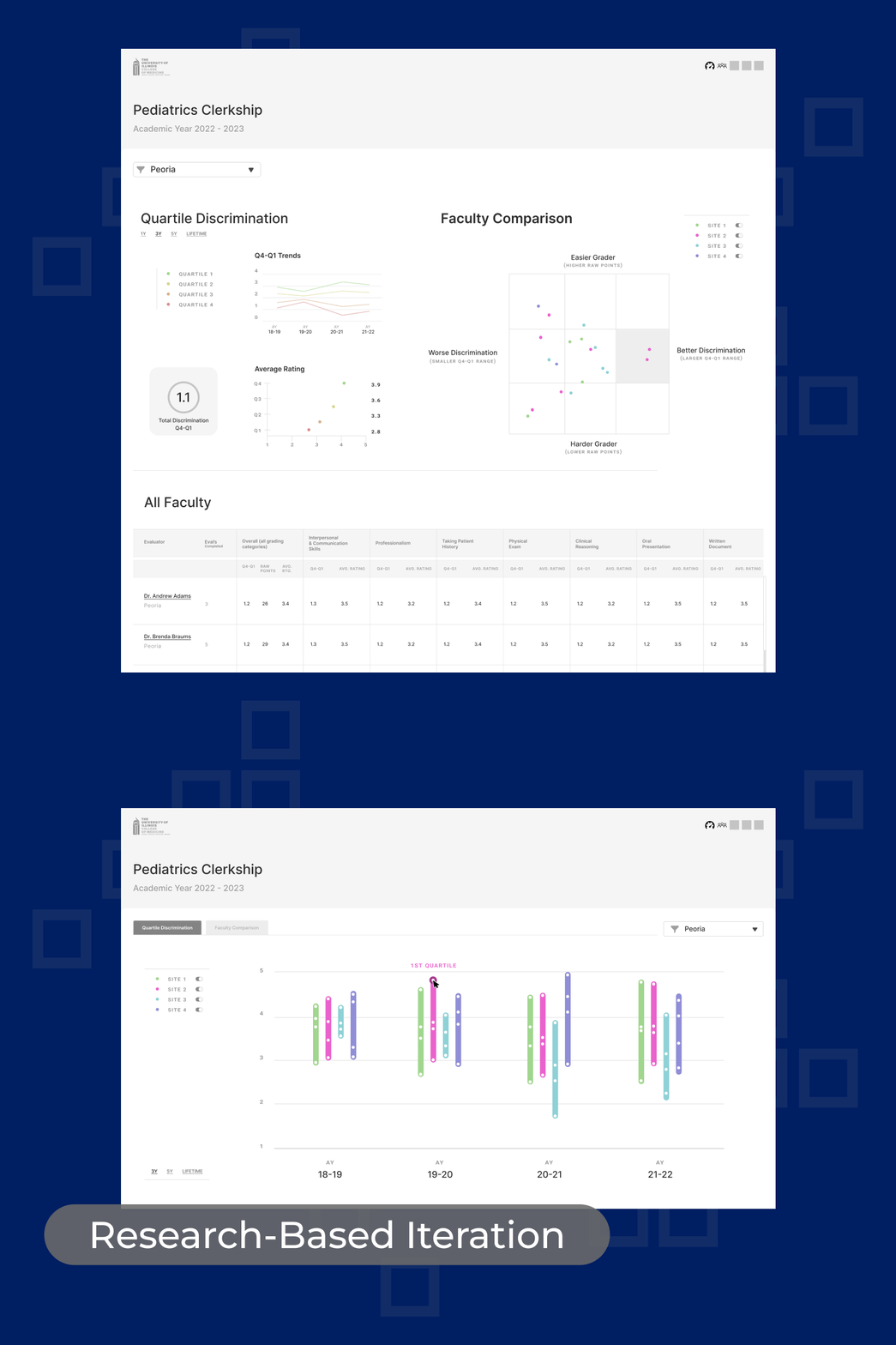
Challenge: In addition to clerkship directors and faculty monitoring student performance in the clinic, how do they monitor grading trends of the faculty? And more importantly, what actionable information is gleaned from that performance data?
In these additional flows, clerkship directors can evaluate session performance based on assessment scores and student surveys. They can evaluate faculty grading trends with data visualization screens.
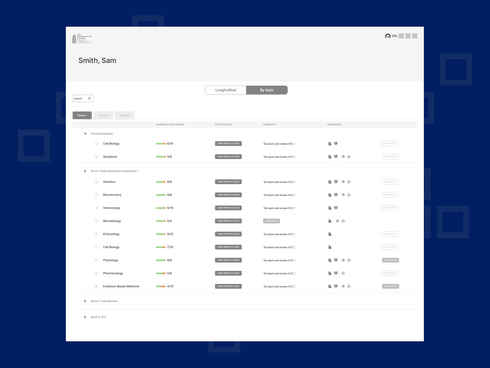
Next, we solved for students, and the lack of a system to help them keep track of where they were in the curriculum, alongside a segmented track of Blocks, Clerkships, Labs, and Standardized Exams.
This student screen solves the problem of by-topic and longitudinal score performance being historically difficult to assess. This “By Topic” view allows the student to not only see their aggregate scores in a topic, but also to download study materials as they prepare for large Licensing Exams.
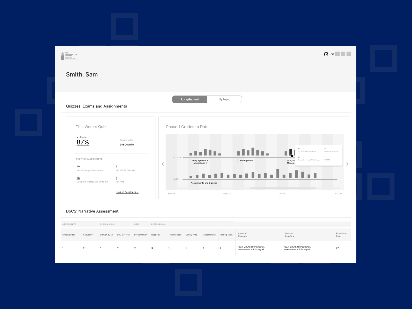
This “Longitudinal” view allows the student to view their scores over time, which was previously missing in their campuses’ digital platforms. This is meant to help the student so that they can zoom into a struggling session (by hovering and clicking through to curricular information.)
Also, by being able to view Blocks (classroom) and DoCS (lab) performance in parallel over time, it brings centricity to the timeline of learning that occurred in different settings.)
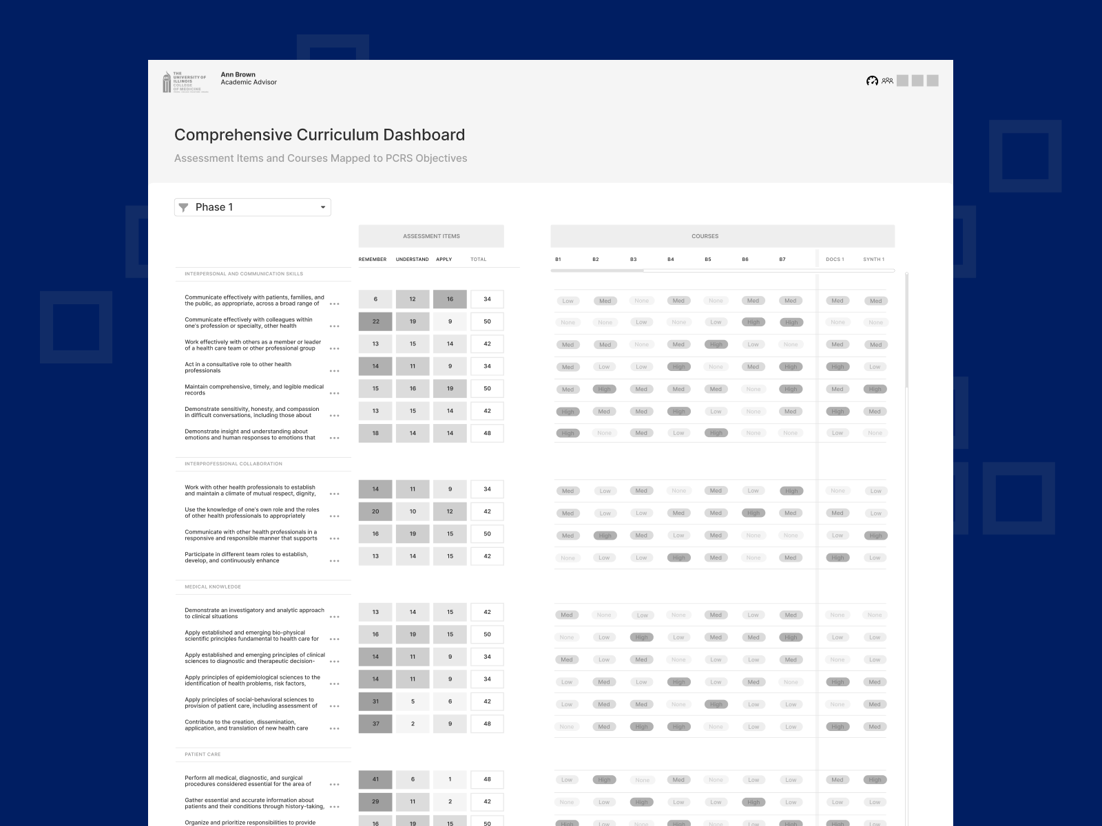
For curriculum leaders, a need that surfaced from interviews was seeing how learning objectives are represented through all phase one courses, labs, and clinical rotations. This wireframe shows how a heat map could be applied to show how many instances of the objective occurred.
User Interviews
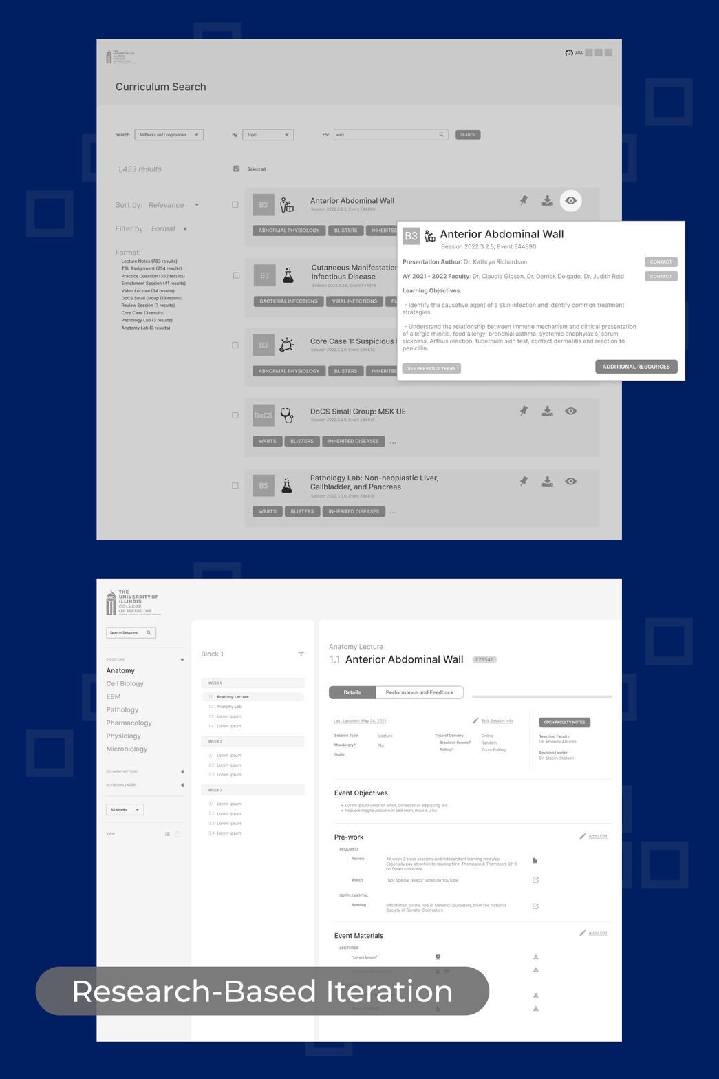
Research-based iterations on wireframe concepts, after circling back with original interviewees.
An important step in the research and design process was to share the slew of wireframes to many of the interviewees we’d previously shaped our concepts from. We carried out a research phase of getting feedback on the work we had done.
Below are just a couple of those iterations:
In a previous iteration of wireframes designed for faculty performance, we showed grading trends in table format. This received lukewarm feedback in user interviews. What we distilled was that the missing point was “How appropriate is an individual’s grading, both compared to other faculty, as well as to the grades they give as an individual?” We’ve invented a way for identifying these markers visually with a scatter plot marked with an “ideal zone.”
I started out with a solution to the display of a course session as a pop-up on the curriculum map. In finding that the information on a session was more in-depth, I iterated on a design for an “Activity Card” module for the course sessions. Basic info was on the front of the card, and its stats lived on the back — like a baseball card.
