Project Description
UX Case Study:
Helping Machine Technicians find Equipment Files
Caterpillar Inc.
Introduction
The most frequently visited Caterpillar website is called SIS, a web application used by dealer technicians and customers who are looking for information to service, troubleshoot, and repair machines.
SIS can be thought of as a massive, interactive manual for every machine that’s left the factory floor. Today, Caterpillar machines run with a host of electronic software systems, and each of these components ingest and produce digital files.
My role
I was the sole UX designer to create wireframes, schemas, and solutions to improve the experience around digital files that come on and off the machines. As you’ll read…
I ultimately decided to label the feature “Equipment Files,” as a way to centralize and simplify confusing workflows.
I had the opportunity to witness demos in the field, painting my mental picture of user pain points. I collaborated closely with several product owners and SMEs to discover and design a solution to the user’s problem. Finally, I was also able to conduct evaluative qualitative user research for my designs.
Problem
After spending some time in discovery of the both the user’s experience, as well as product requirements, I was able to craft a four-part problem statement:
A four-part problem
Disparate navigation: Users were forced to navigate from unintuitive and disparate links in the navigation to find files, despite having been driven there by a single motivator.
Not scalable: The product team had planned to introduce new file types to the machine capabilities, however, the current pages for files lacked a scalable design to accommodate these new types.
Disjointed UI patterns: Users were forced to search for files with completely different mental models, based on file type.
Lack of a strong and intuitive label: The name that the product team had given to the project internally did not match the mental model of our users.
Solution
After defining problems, I saw an opportunity to create what I called a “global solution.”
I thought that a “global solution” might…
- Allow users to find files easily, with consistent experiences across various motivators and intents.
- Reduce cognitive load and clicks by allowing users to find files amidst a complex set of search parameters.
- Provide users with a single location for files within a single user scenario, reducing clicks. (Previously, users had to navigate to different parts of the application to solve one problem.)
- Provide an option for easy sharing of very specific file lists. (It would allow for robust query-parameter URL addresses.)
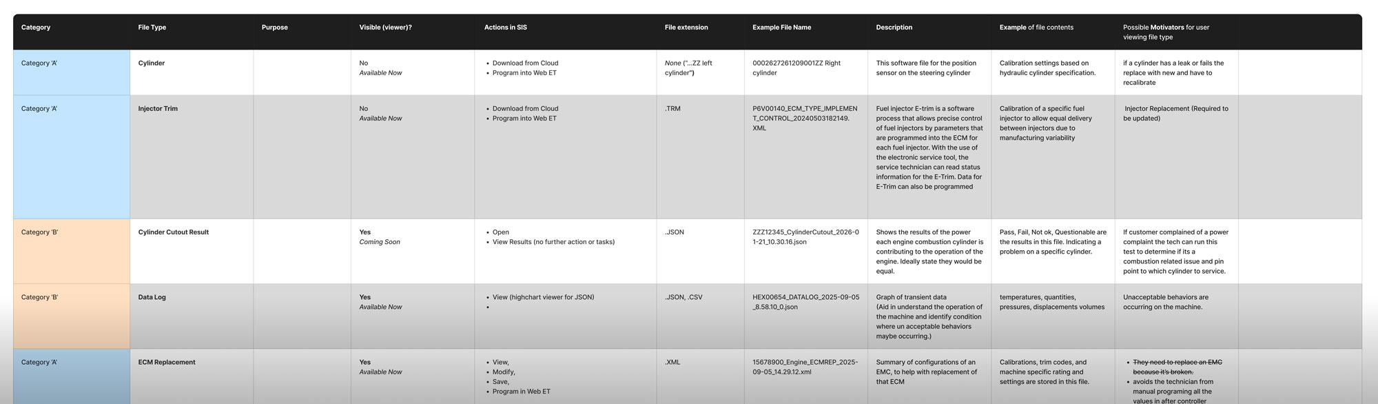
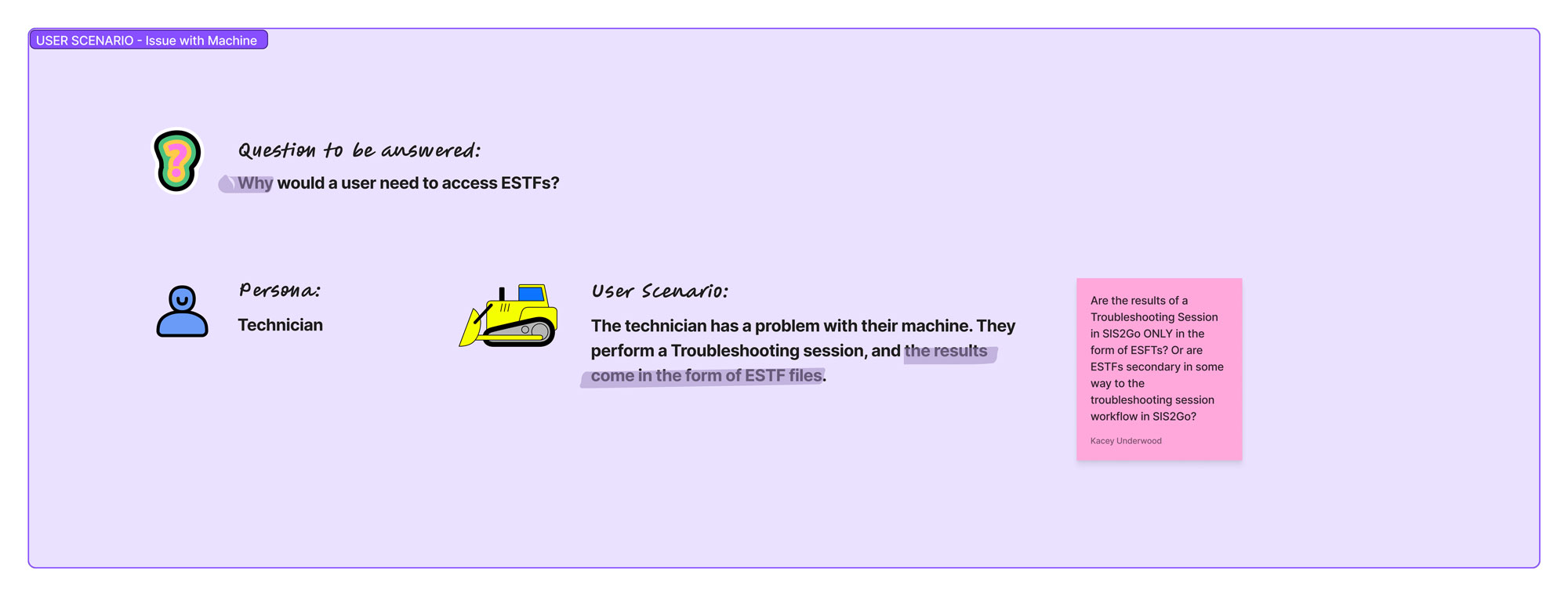
I created the “figjam” presentation below to outline the problem and solution to my team mates, in order to get effective feedback on the solution.
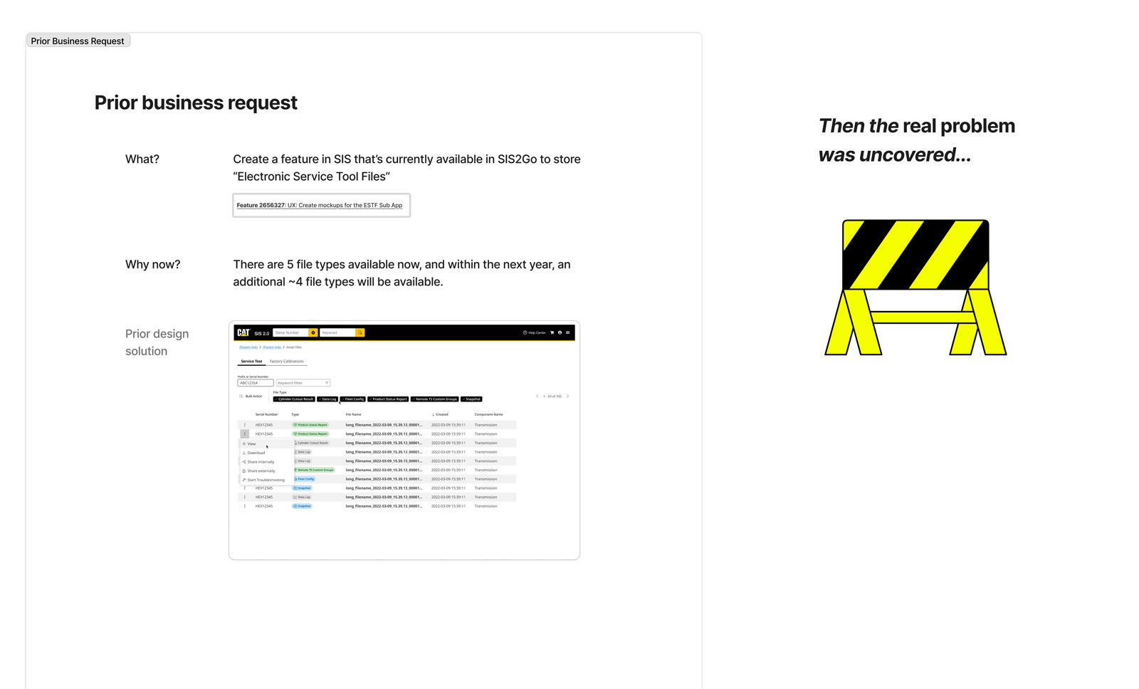
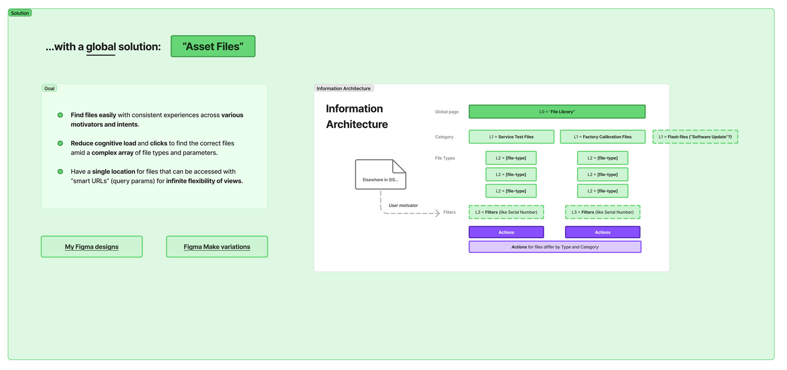

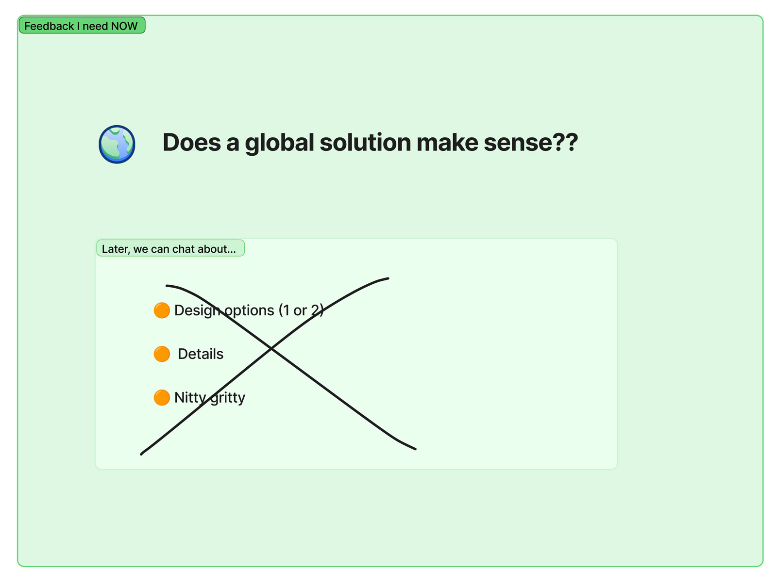
Images above: four sections of a Figjam file that I used to gain feedback on the problem statement and solution, conceptually.
Methods
To design a solution to this problem, I initiated lots of discussions with SMEs and product owners. I aimed to understand the user experience and the technical know-how of files: what were all the machine file types? What were they used for? What scenarios would motivate a user to access these files? Which files could be downloaded, and which could be programmed, and why?
An SME invited me to Peoria, IL for a demo in the field. I was able to see the real-life process of climbing into the cab of a machine, plugging a PC into a port using a proprietary cable, and capturing and programming various files.
After discovery, I crafted my problem statement, based on a simple heuristic analysis, plus the empathy experienced during my field demo.
I created low-fi designs, ran them by my fellow designers, and then I iterated with my product owner on high-fidelity designs. Lastly, I led moderated interviews with about a dozen users to evaluate specific parts of the designs.
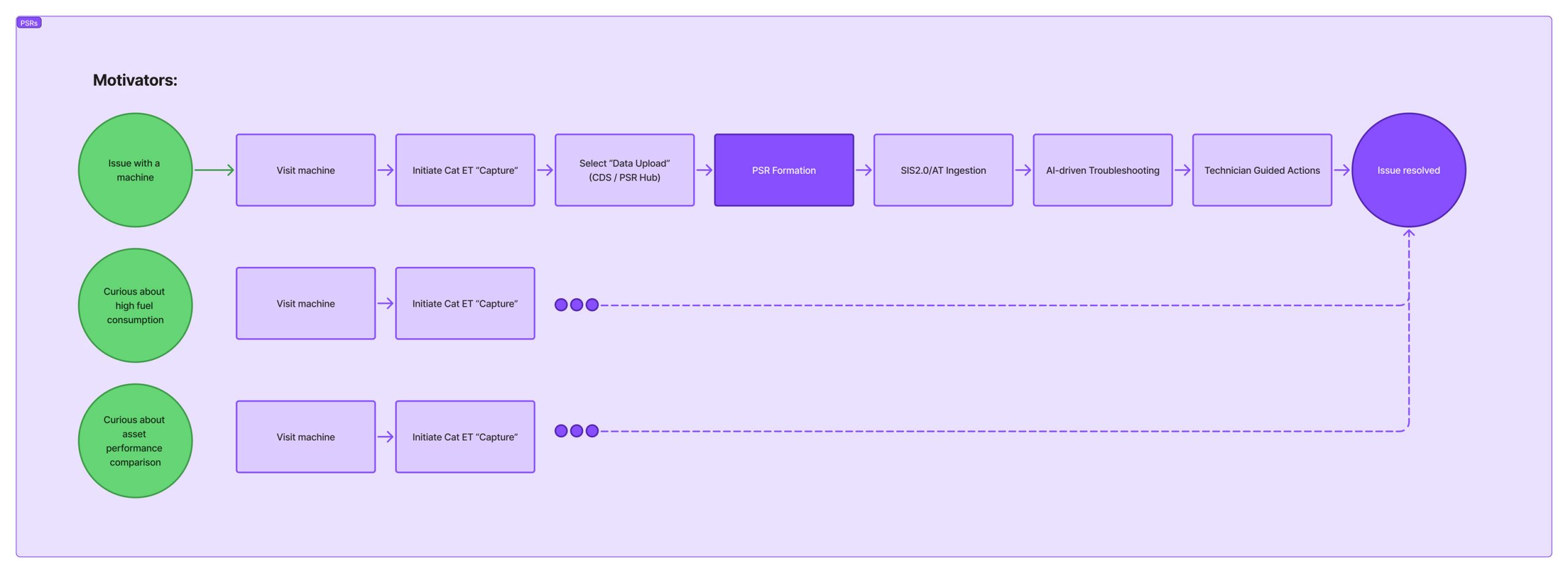
Image: One of many UX activities I completed to understand the user workflow. This flow shows that several motivators lead to the same user actions.
Solution to: Disparate Navigation
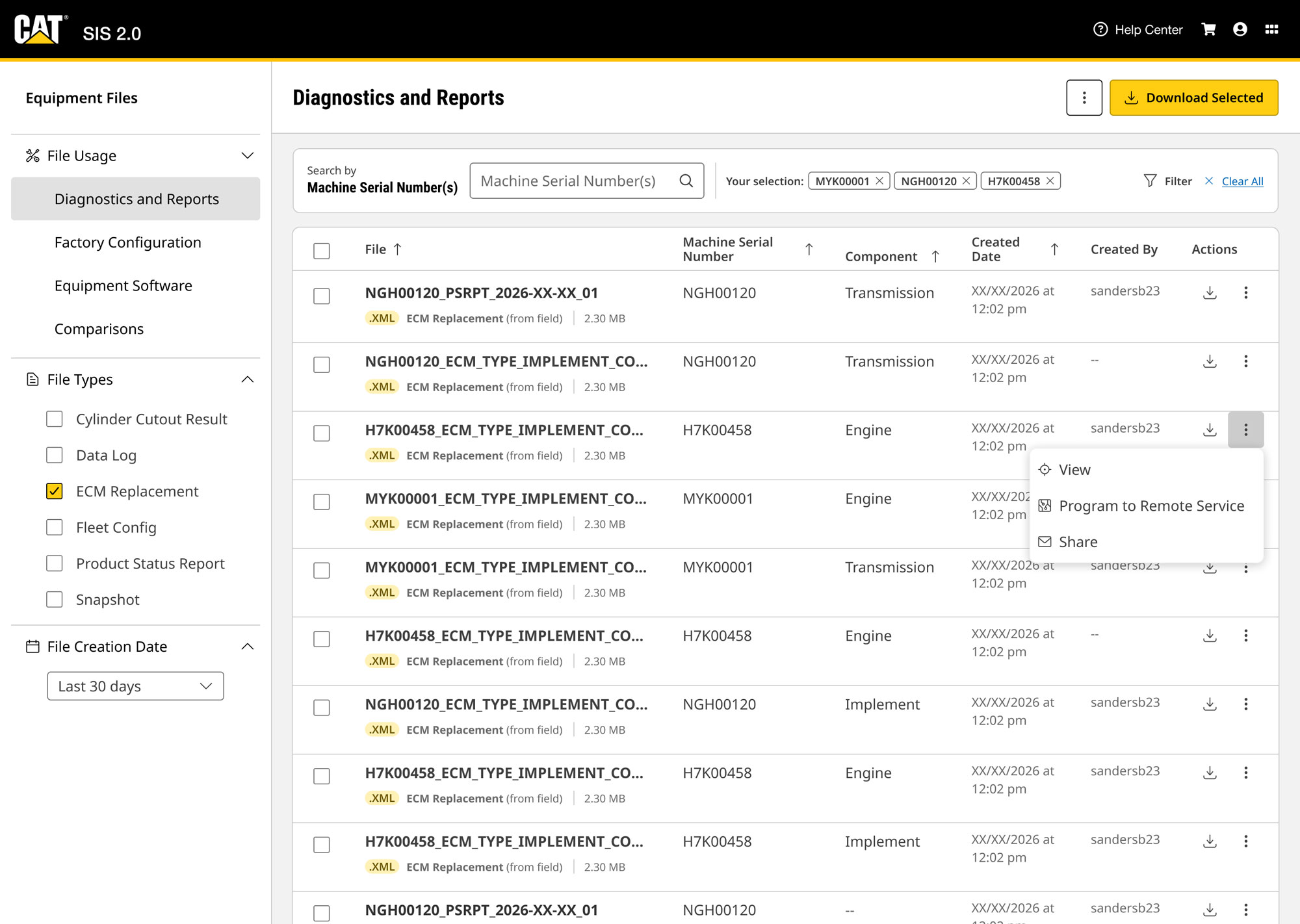
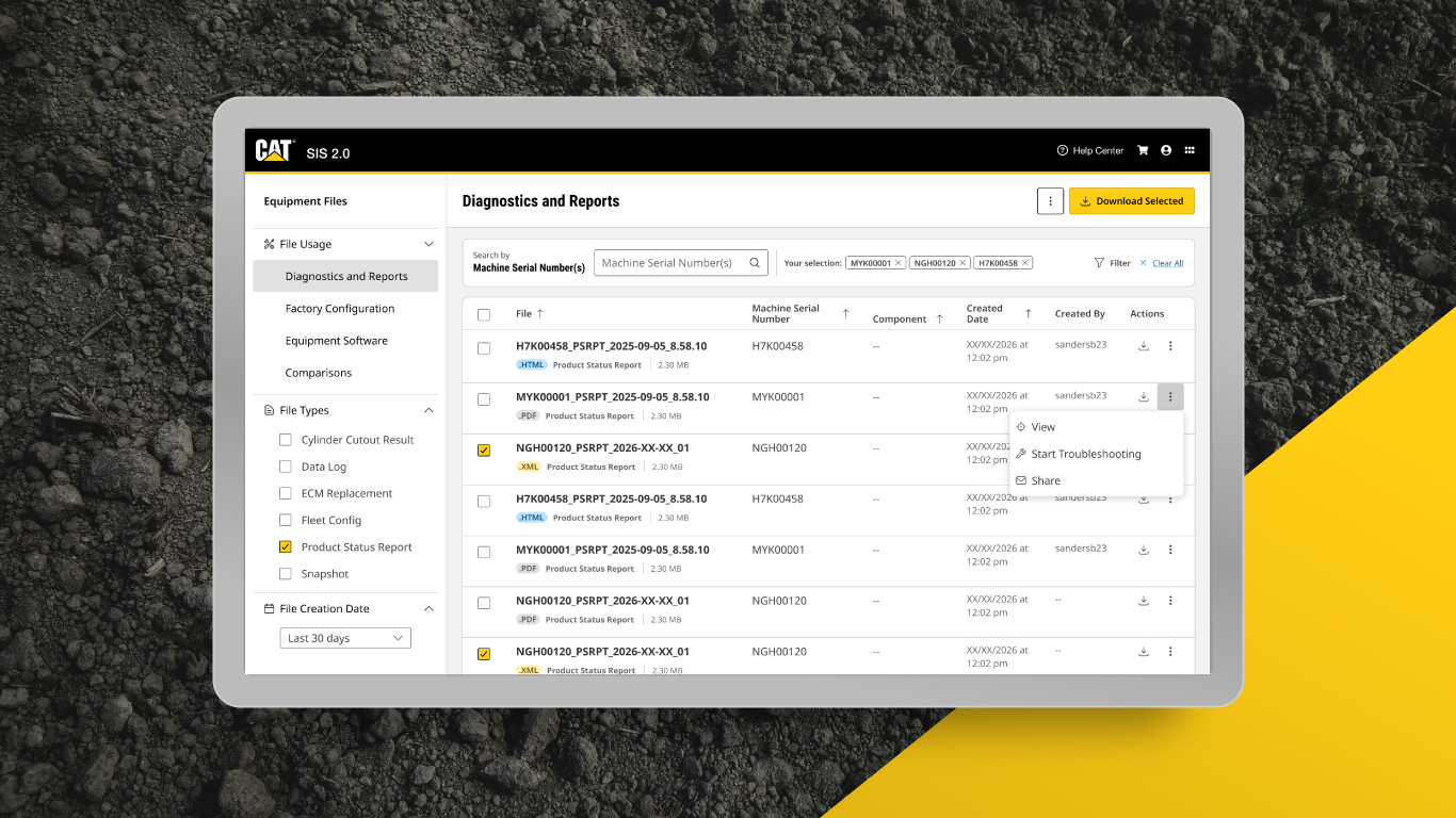
I designed a screen that placed all file types in the same place, with easily navigable facets to access them.
A faceting system (i.e. categories) was necessary, I determined. So I found the minimum commonality across the file types and associated them to a new mental model: file usage. My hope was that users could easily identify the correct facet that the files would be found in.
Furthermore, the facets allowed for a useful treatment of table columns so that the files could be quickly distinguished and identified.
Solution to: Not Scalable
The solution I designed accommodated for existing and future file types. By bucketing file types into a couple facets within the left hand rail, plenty of vertical space would remain available even with the introduction of new types over the next couple of years. Also, with the data table treatment, lots of files and types could be accommodated.
Technicians are power users in reading spreadsheets: they’d voiced their appreciation for accuracy, and the ability to reference dense information at once. My hope was that they’d feel the same about this data table treatment.
To reduce cognitive load within the data tables, I chose to introduce color and badges. Knowing that technicians identify and recall files by their type (e.g. Product Status Reports), I chose to represent file types as badges. This further matched the mental model of the user: “First, I want to look up this machine’s Data Log files. Then, I might need to program a calibration file, if I find the problem.”
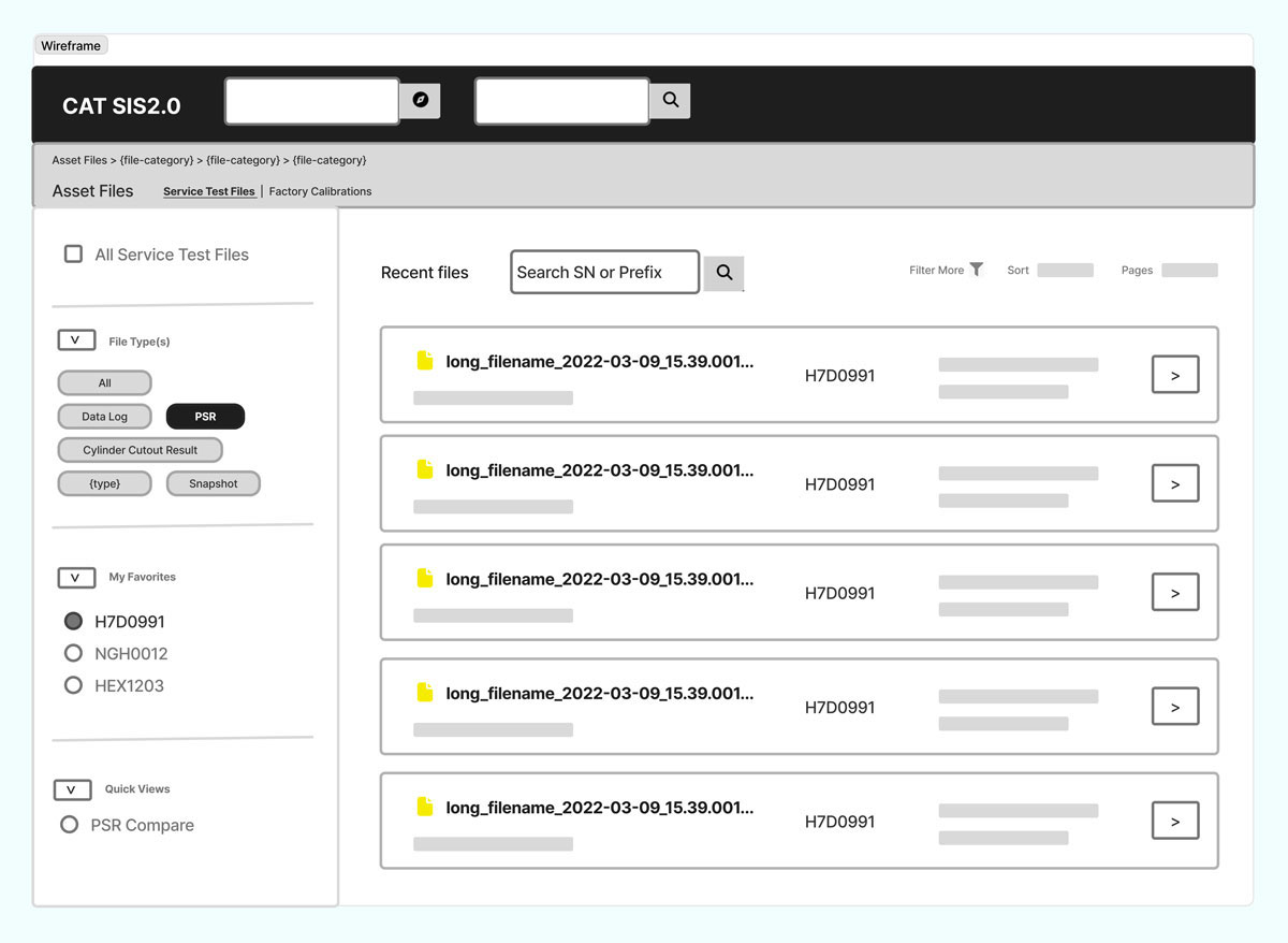
Left: a low-fidelity design iteration playing with tab and checkbox style faceting systems.
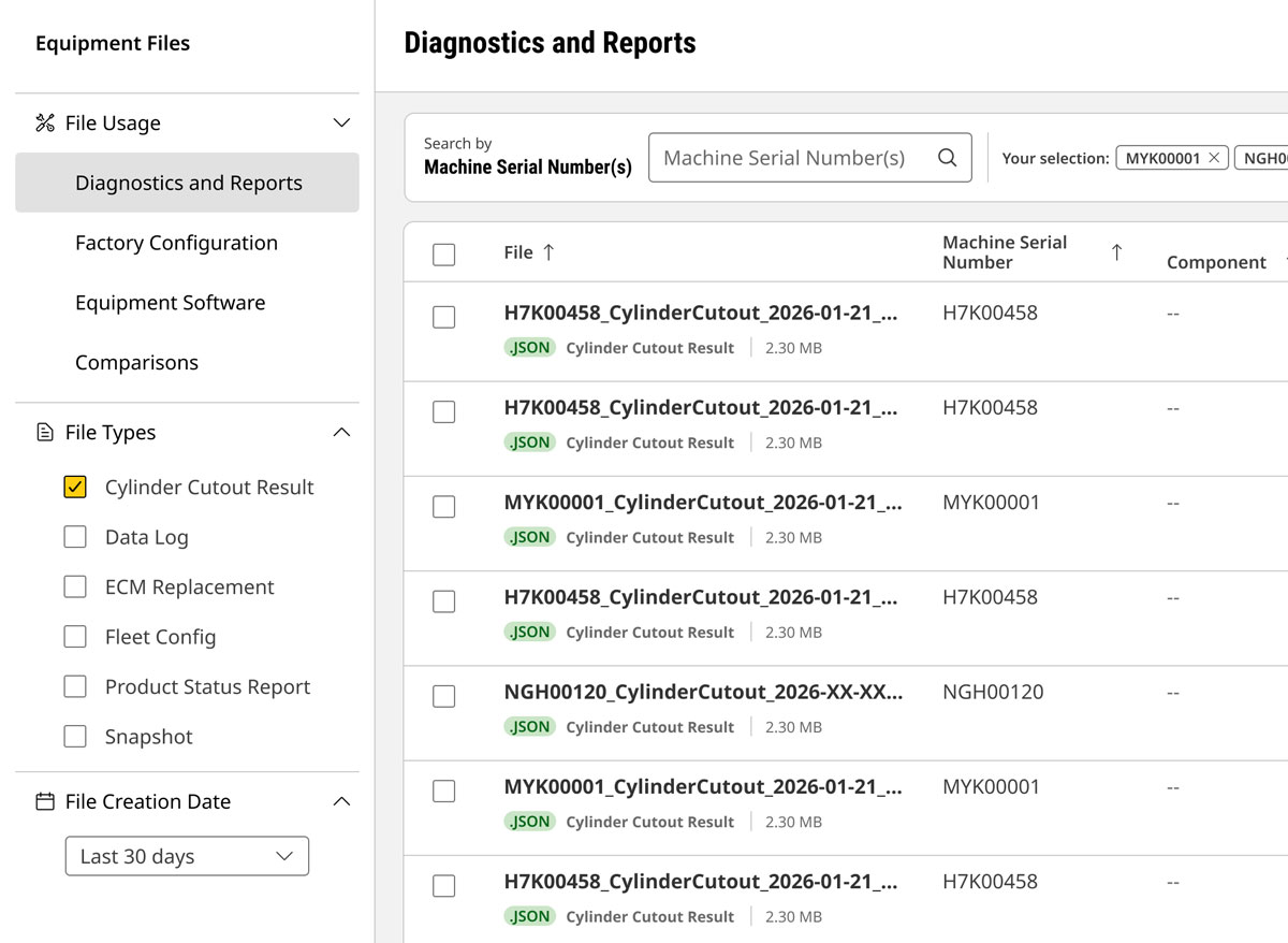
Right: a high-fidelity final iteration showing just one file type being selected from a list.
Solution to: Disjointed UI patterns
Perhaps the biggest challenge in leaning into a single, unified treatment for this set of ten file types was this:
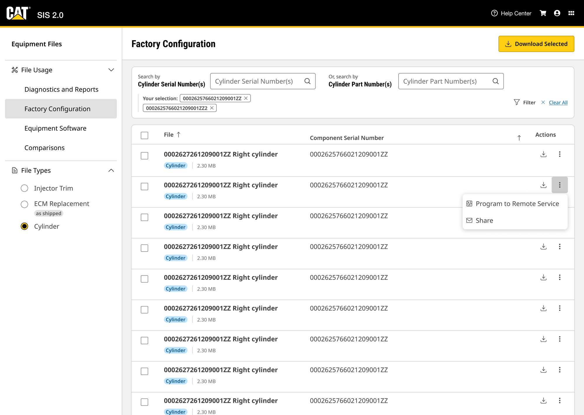
The different file types required different parameters to be searched for. For example, a cylinder file required a part serial number, while a data log required a machine serial number.
Additionally, the different file types benefitted from different columns (or attributes) to be identified.
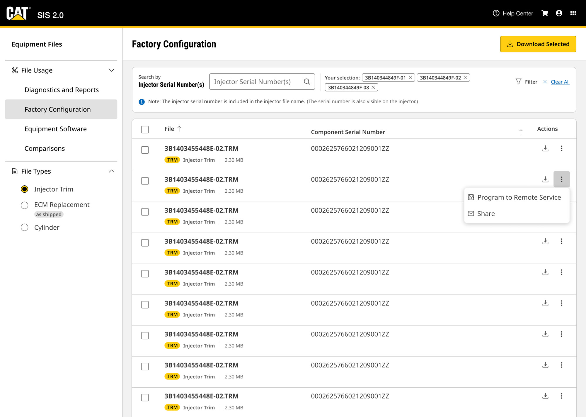
Because of this, I added some variation in the table layouts and the search parameters on the different facet pages. Facet pages made this successful, as well as keeping consistent styling. I also made an effort to create a strong visual focus on the page in order to help the user know what to search.



Image: While there were different ways of searching for these three file types, I hoped that the visual cohesion would help to create a recognizable pattern and keep focus.
Solution to: Lack of Strong and Intuitive Label
At the beginning of this design sprint, the product team requested to name the feature “Electronic Service Tool Files.” I found, during my discovery process, that this name didn’t reflect the usage of all the files I would be including in the feature.
I began an iteration process where I spoke with Caterpillar content experts about different naming options like, “Machine Files,” “Service Files,” “Asset Files,” and “Equipment Files.”
In the end, I decided that “Equipment Files” was the most relevant label, and I was able to evaluate this label with a research activity with our end users.
I also tested the naming of facets, and iterated on these names in real time, from interview to interview.
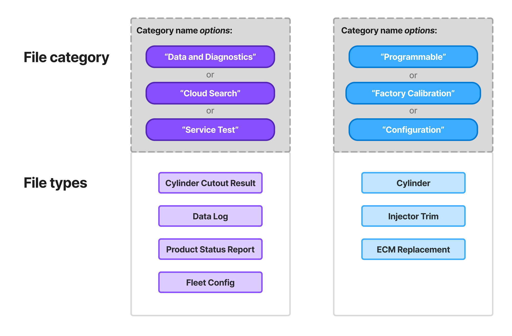
Image: this is one of the artifacts I showed in my evaluative research sessions with end-users. Users chimed in with feedback on what names they would prefer for the “categories.”
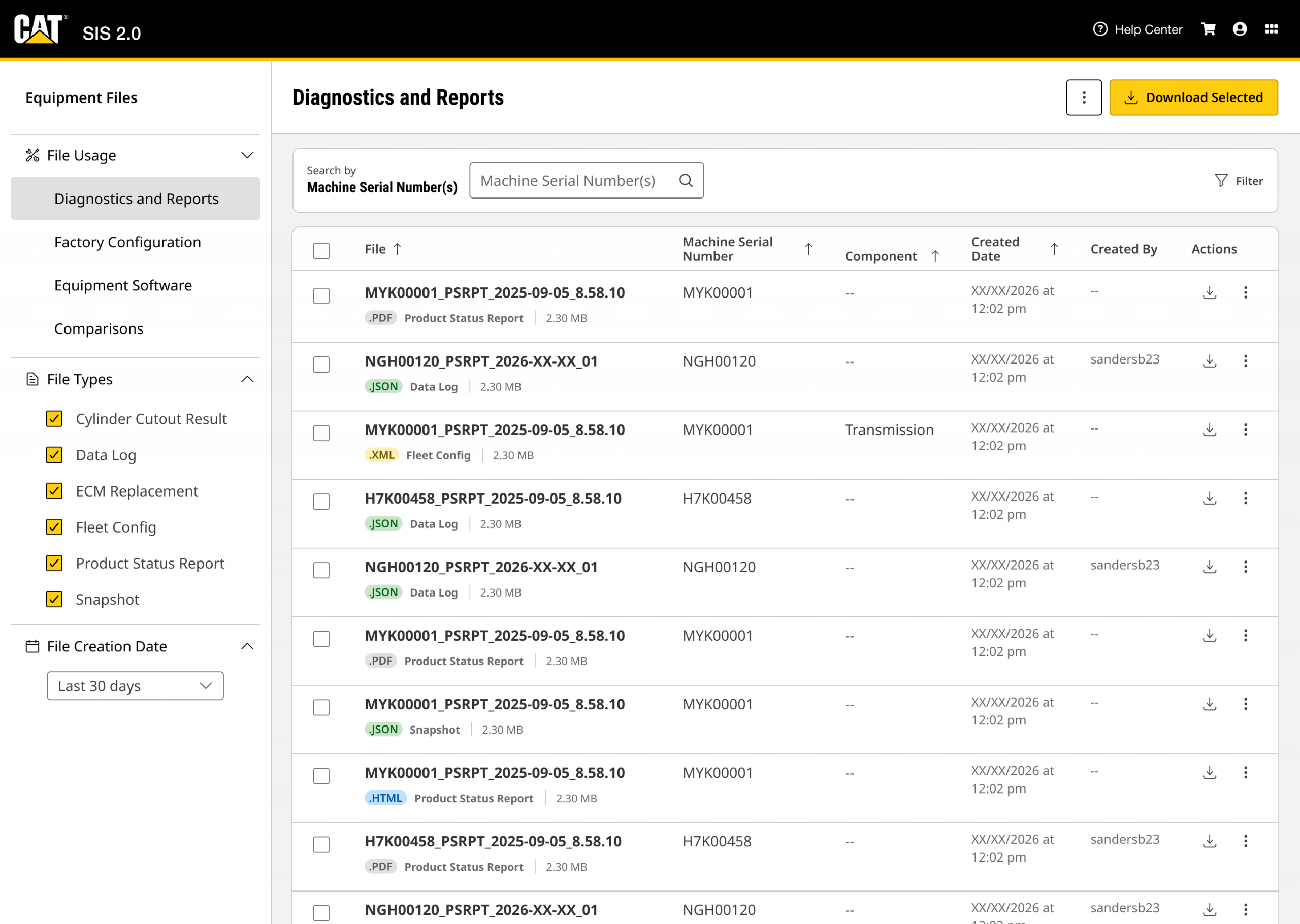
Image: high-fidelity final design that includes “Equipment Files” as the feature name, as well as iterated facet names of “Diagnostics and Reports,” “Factory Calibrations,” etc.
Evaluative research
I interviewed about a dozen end users, using a mixture of conceptual diagrams and high-fidelity prototypes. I consulted the UX researcher on the team to develop a script that would avoid leading questions, in order to gain confident conclusions about the designs.
The research enabled two conclusions:
- I was able to iterate on the naming of facets (categories) and ultimately land on ones that allowed the users to easily identify and recall the placement of certain file types.
- I was able to move forward on the “global solution” as a whole.
Users said, in their own words, “Having these files in one place without having to click around elsewhere will definitely help us to get the files we need quickly so we can get back to turning wrenches.”
Implementation
In the end, these designs made it through product backlog grooming with a few minor tweaks for development, and the development is being completed.
Conclusion
I’m satisfied that my ability to uncover more nuanced user pain points and scalability issues led me to a “global solution” for file navigation.
I’m hopeful that the qualitative research I led will accurately reflect the user’s experience as time goes on, and that users can easily continue to access files from this new system. I’ll be curious to collect more quantitative data around the enhancement, and see how we might improve it more in the future.
More from my design thinking and discovery work: