Project Description
Chapter 1
Findings
Quick summary of UX findings:
- Cognitive load Reduction
- Management of daily work
- Re-focusing patient architecture
- Streamlining specimen and shipment workflows
- Dashboarding analytics
A. Cognitive load reduction
Our persona interviews surfaced an important commonality: the users’ jobs were incredibly detailed and “in-the-weeds”:
- The interfaces of the old system were cluttered with numerous fields and excessive information, overwhelming users.
- Each time challenged their need to see all of those fields, they reiterated that inclusion of all fields was necessary.
We would need to find a way to reduce cognitive load without removing content.
We would need to find a way to reduce cognitive load without removing content.
B. Management of daily work
Our research surfaced challenges around managing daily work:
- Delegating work was not always cut-and-dry. Some of the teams interacting with the system were fairly large, and most often, multiple eyes were required on the same order, specimen, or patient. Resolution of issues required phone calls, emails, notes, and cross-system usage. Users always needed multiple tabs open to reference other systems.
- Many of the issues needing resolution were complex in nature and often required multiple users’ own knowledge and background information.
- Much of the time spent by users was focused on painstakingly tracking down orders or patients, like a treasure hunt. For example, users would be forced to use the slow and clunky filtering capabilities on the old system to open multiple tabs to see if they offered the right set of characteristics for the user to accomplish their tasks.
- The highlight use-case for the OMS was that users needed to manage their daily work by looking for active orders that had similarly related problems. This cognitive approach helped them address the same class of problems within a period of time.
C. Refocusing patient architecture
Adaptive aims to be a patient advocacy organization. There is immense business value in orienting the user experience around opportunities that efficiently clarify patient information.
We discovered the following pain-points for users viewing patient data:
- Patient Details pages lacked real-time information about Orders and Specimens.
We discovered that this information was the most common focus of inquiries by our customers (who, in this case, are clinicians offering clinical care for their patients.) Ie. Users of the OMS had to search for a list of orders relevant to a patient, open all those orders in separate tabs, and then cognitively distill the most recent issues and statuses. - Patients often showed up as duplicates in the system.
Due to easily made human errors of birthdate or name-change discrepancies, one patient might end up in a fragmented display of duplicate records. These were high-priority issues that our users had to address. - Information architecture was oriented around Orders, not Patients.
If a physician called in curious about the status of clinical care for one of their patients, there was no quick view in the old system to provide that information. - Clinical trials offering de-identified information had no way of linking to Patient information that was already in the system. The implication for patients who were also in Clinical Trials could be painful: they would have to take multiple blood or bone marrow samples to provide the same information, over and over again. This highlighted a high-priority concern: the fact that the information was in the system but simply lacked the wiring to connect.
D. Streamlining specimen and shipment workflows
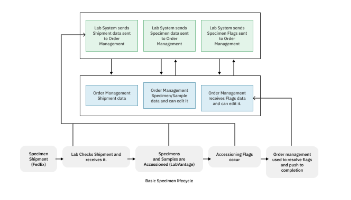
Historically, the molecular biology laboratory at Adaptive, which handles specimens and samples for Clinical Diagnostics and Clinical Trials research, has used varied terminology and labels across its systems. The data transfer between these systems is nuanced and complex. To streamline this, a significant reorganization effort was undertaken to simplify system labeling and clarify the parent-child relationships among specimens, samples, shipments, and orders.
We discovered the following needs for an improved treatment of Specimens and Shipments:
- The users of the OMS and LIMS at Adaptive required a unified approach to manage specimen samples and shipments across these two software systems.
- Within the OMS, it would be critical for the customer-facing teams to receive timely updates once specimens completed the intake process and were ready for the resolution of any flags that may have arisen during the shipment receiving or intake phases.
- Users would require a centralized interface for updates and data, rather than being forced to navigate multiple siloed sources like Salesforce and Tableau. This fragmentation complicated workflows and hampered efficiency, highlighting the need for a more consolidated, integrated approach to data management and notification within the ecosystem.

Lastly, the information architecture was finalized as follows:
Order > Specimens > Samples
An Order was a parent entity to Specimens, which were parent entities to Samples. (Samples were essentially smaller quantities of the original specimen that could be fragmented into smaller quantities for different laboratory workflows.)
Shipment data could finally be represented in just a few attributes of Specimens.
E. Dashboarding analytics
The new Order Management System (OMS), used by various customer-facing teams was lacking the contextual tools necessary for understanding:
- Order statuses
- Issues
- Assignments
Additionally, leadership faced challenges in gaining deep insights into critical metrics like:
- Revenues
- Sales
- Turnaround times
- Incoming order volume


