Project Description
Chapter 3
Management of daily work
Flag lists
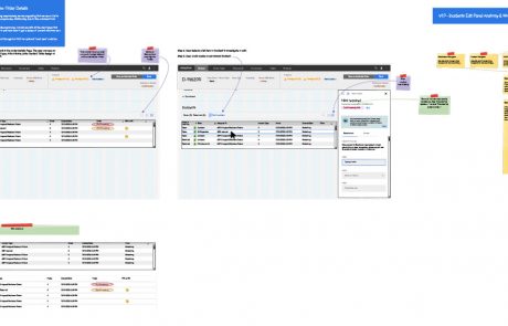
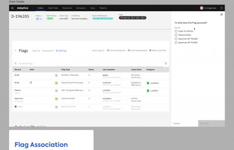
On each Order, Patient, and Subject page, we included a Flag list (in the form of a data table, mentioned above.) Flag lists aimed to help users manage daily work by:
- Prioritizing work by surfacing it as a Flag.
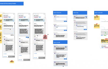
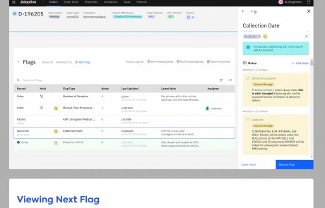
- Incorporating the right-hand Flag Panel, that could be opened beside to the Flag table, to resolve and work on individual Flags.
- Providing useful columns so that users could scan for Flags that suited their workflow in that moment.
- Providing search and filter capabilities to also identify specific Flags that the user is most interested in tackling.
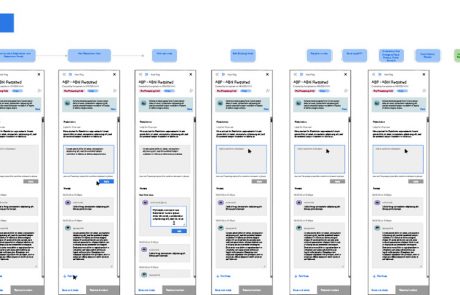
- The inclusion of arrow navigation in the right Flag Panel allowed users to click through in succession and scan the contents of Flags, easing the ability to make a decision on where to dive into work resolving Flags.
We would need to find a way to reduce cognitive load without removing content.
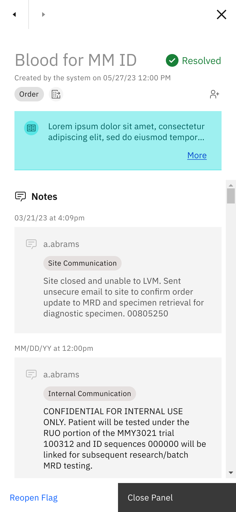

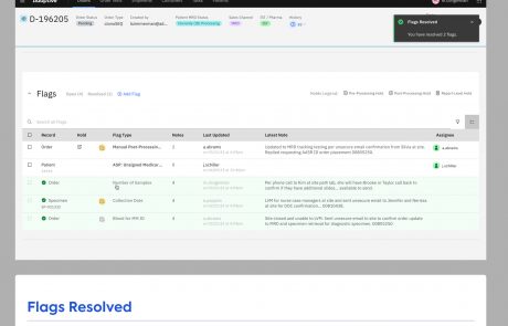
Image: the Flag panel, in this case showing the “Resolved” state, supports a clear workflow for users to resolve issues.


Image: high-fidelity design close-up of the Flag Panel’s navigation arrows.
Assignment
We designed an Assignment feature, which allowed users to self-assign Flags and Reports. This feature did not “lock” an assigned record, but rather gave notice to other users who the intended owner of the Flag was. In other words, the Assignment feature still allowed other users to collaborate on the record.
Coupled with Flags, the Assignment feature was created as a way to address the struggle of managing daily work:
- A user could use the Assignment feature as a mental model to bookmark a set of Flags that were cognitively related, so that they may tackle those Flags as a group, applying similar problem-solving at once.
- The mental model of bookmarking similar Flags by Assigning could also be used as a way to break up work for a time period. Eg. a user could accomplish the resolution of ten similar flags in one hour.
- Seeing that a Flag was assigned to a different user also helped to reduce focus from Flags that had already been started on.
- Use of color in our assignment icon (green) helped as a recognizable visual anchor that was repeated across screens.


Image: documentation I created in Figma showing the usage of an Assignment component.
Advanced Search and Filter pattern
The combination of Carbon Active Search with our custom filter bar aimed to manage daily work in the following ways:
- Our selection of columns also helped manage daily work. For example, on the Flags lists displayed at the Order level, a column that showed the truncated text of the most recent Note helped the user to quickly clue into the heart of the work that they or a team member had recently done on that Flag, quickly sparking an idea for where to jump back in.
- Another example was the inclusion of the Holds columns, as indicated by an icon denoting the type of Hold. Users could sort Flags by all “Pre-Processing Holds,” for example, viewing those at the top of the List and perhaps prioritizing these items.


