Project Description
Chapter 5
Streamlining specimen and shipment workflows
From our findings, the treatment of Specimens and Shipments would need to streamline the data transfer between OMS and LIMS, as well as provide timely updates on shipments, to manage processing.
Two key outcomes of our design solutions were:
- The introduction of Flags
- The redesign of the data display in Specimen tables
Data table expandable rows
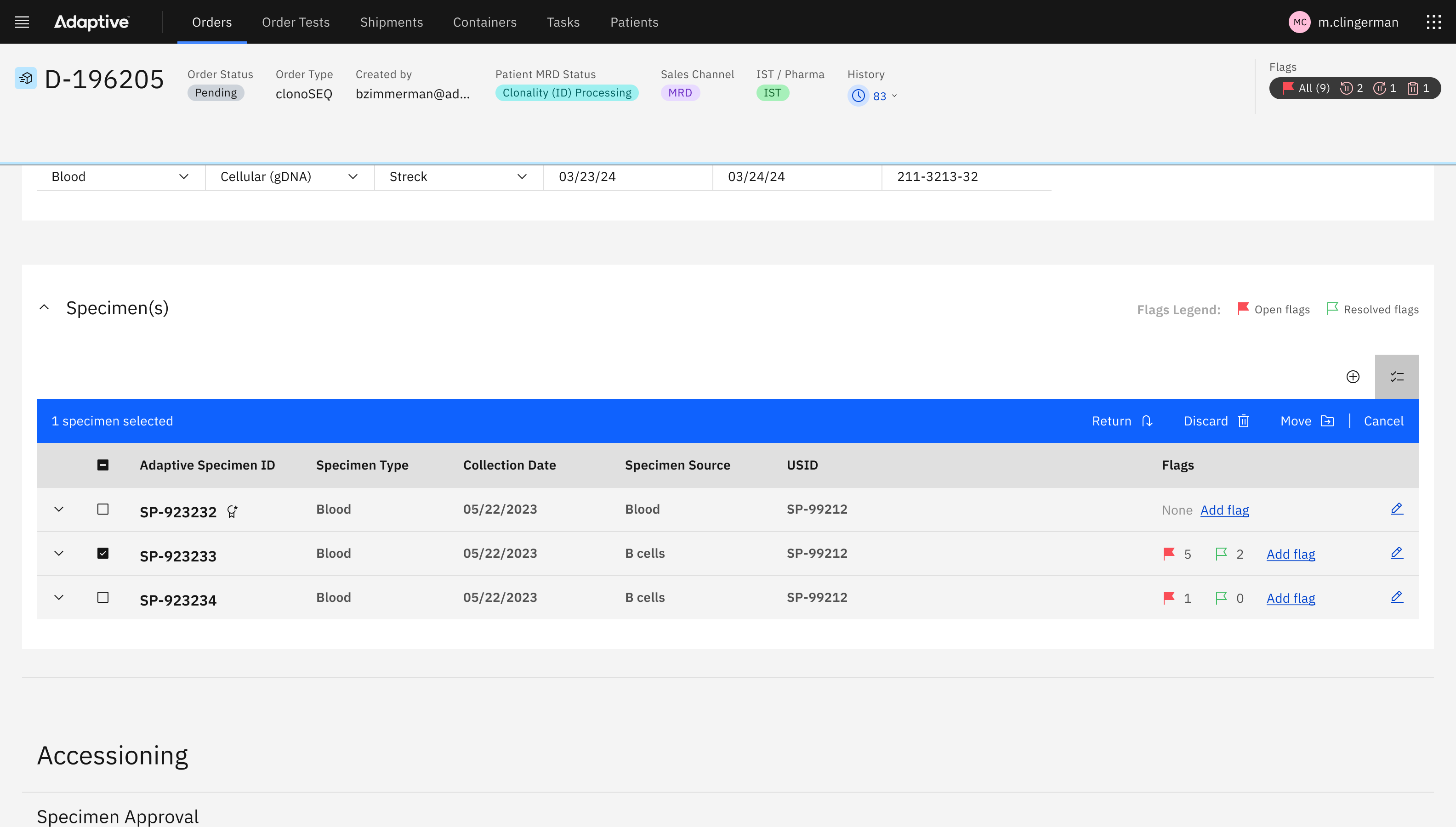
To address the challenge of a deep and detailed information architecture of Specimens and Samples, we leveraged Carbon’s data table expandable rows:
- We treated expandable rows as a way of deemphasizing secondary information on Specimens, as well their child-elements, being Samples.
- We worked with the SMEs to identify which attributes of a Specimen were primary in hierarchy, and which were secondary.
- We selected fluid states for the read-only fields visual clarity; this created the feeling of a concise grid within the expandable row.
Data table iconography
To add further complexity to information architecture, users required that the data table also signify Specimen statuses:
- We incorporated icons into our Carbon data tables to indicate status
- We selected an icon to represent, processing, completed, moved, discarded, and returned.
- By using icons instead of text, we decluttered a text-heavy data table.
Data table toolbar
We leveraged the Carbon data table toolbar to address the specific needs of user’s needs in the Specimen table:
- We re-used the investment in our toolbar design to include search, filter, and batch select tools.
- We discovered a new set of batch-action tools that the users would require in Specimens, and added them to the batch action bar. These were particularly important in Clinical Trials orders, where there may be hundreds of Specimens in one order.
- We identified the filtering options to address the most common workflows users would need to do their work on Specimens.


