Project Description
UX Case Study:
Modernizing the delivery of diagnostic and research assays at a biotech company.
Adaptive Biotechnologies
Introduction
Adaptive Biotechnologies, headquartered in Seattle, was upgrading its diagnostic sample Order Management System to replace a cumbersome legacy software. This initiative aimed to empower customer-facing teams to more efficiently handle the ordering process of diagnostic assays.
However, their tasks were highly detailed, and the old software lacked essential safety checks, posing challenges as the company anticipated a significant increase in order volume in the coming year.
By implementing new software solutions, Adaptive sought to streamline operations, enhance user experience, and modify procedures to better support its expanding customer base while keeping its commitment to excellent patient care.
The UX team was asked to focus on reimagining and enhancing the Order Management System (OMS).
Replacing legacy software
Problem
To discover the main problems with the user experience, I spent several months conducting dozens of qualitative interviews.
The Order Management System caused many inefficiencies for users, wasting money for the company.
I uncovered three main problem areas:
Quick summary of UX findings:
- High cognitive load (inefficiency)
- Cumbersome management of daily work (inefficiency)
- Lack of analytics insights
A. High cognitive load
My persona interviews surfaced an important commonality: the users’ jobs were incredibly detailed and “in-the-weeds.”
- The interfaces of the old system were cluttered with numerous fields and excessive information, overwhelming users.
- I probed on which fields they needed to see, and which fields they might not need to see.
- Each time that I challenged their request to see all of these fields, they reiterated that including all was necessary.
In other words, the old software system demanded high cognitive load from its users; in other words, too much brain power.
I would need to find a way to reduce cognitive load without removing content.
B. Cumbersome management of daily work
My research surfaced challenges around managing daily work:
- Delegating work was not always cut-and-dry. Some of the teams often had multiple individuals’ eyes across the same order, specimen, or patient. Many of the issues needing resolution were complex in nature and often required multiple users’ own knowledge and background information.
- Much of the time spent by users was focused on painstakingly tracking down orders or patients, like a treasure hunt. For example, users would be forced to use the slow and clunky filtering capabilities on the old system to open multiple tabs to see if they offered the right set of characteristics for the user to accomplish their tasks. Latency in loading results further added to inefficiency and frustration.
- Users always needed multiple tabs open to reference other systems. Resolution of issues required phone calls, emails, notes, and cross-system usage.
- Users needed to manage their daily work by hunting for orders with similar problems, to tackle them efficiently, all at once.
The old system made these similar orders hard to identify quickly.
C. Lack of analytics insights
The new Order Management System (OMS), used by various customer-facing teams was lacking the contextual tools necessary for understanding:
- Order statuses
- Issues
- Assignments
Additionally, leadership faced challenges in gaining deep insights into critical metrics like:
- Revenues
- Sales
- Turnaround times
- Incoming order volume
Design Process
Research Methods
- A small group of subject matter experts (SMEs) were elected to be my go-to representatives for UX research.
- I hosted ongoing one-on-one SME interviews, brainstorming pain-points as well as collaborating on new feature ideation.
- I hosted weekly group SME meetings, where I presented low- and high-fidelity rapid prototypes, collected feedback, and directed further iteration on new designs.
Design Methods
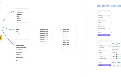
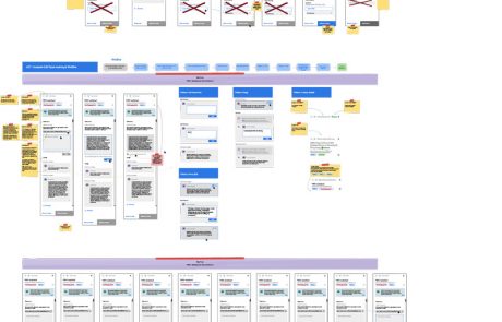
Information architecture diagramming
Low-fidelity mock-ups
High-fidelity mock-ups
Solutions
Solution A
Cognitive load reduction


“Chunking”
I used the “chunking” UX concept to help reduce cognitive load on long, dense pages:
- I visually grouped fields with each other
- I provided a heading for each chunk
- I used the chunking method on the various “details” screens: Order Details, Patient Details, Project Details, and Subject Details.
“Presenting content in chunks makes scanning easier for users and can improve their ability to comprehend and remember it.”
Data tables
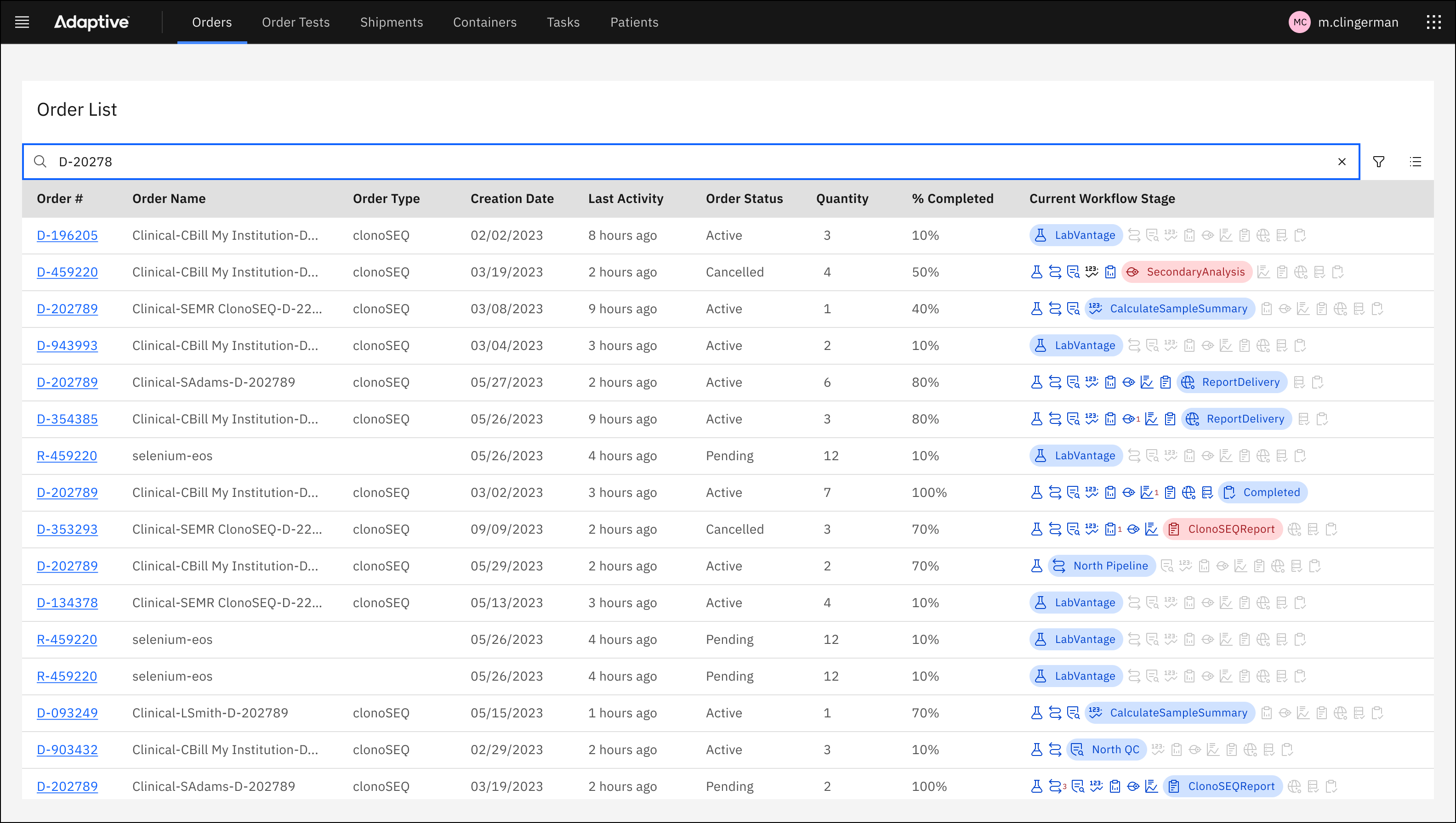
The repeated pattern of data tables aimed to reduce cognitive load in the following ways:
- Recognizing that our users have expert skill and affinity working with data tables and spreadsheets, we surfaced OMS data into thoughtful table design.
- Careful column selection and ordering from left to right allowed our users to see exactly the data they wanted to see.
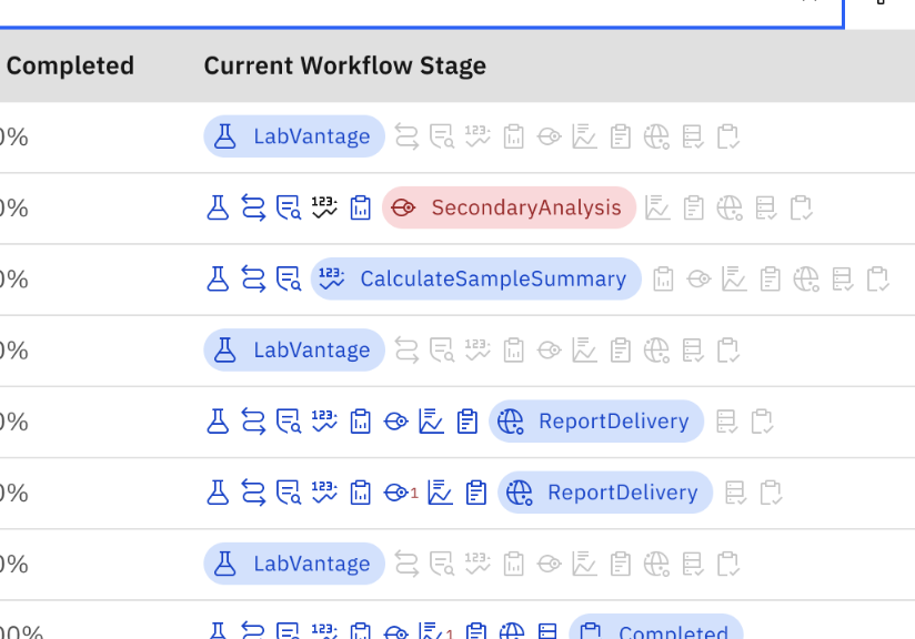
- Use of tags, icons, color, and a humanized label audit made the data scannable.


Image: a closeup of tags representing a process flow
Solution B
Management of daily work
Flags
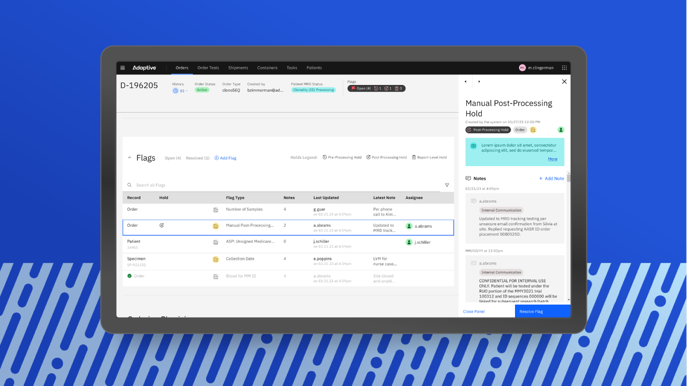
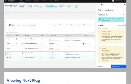
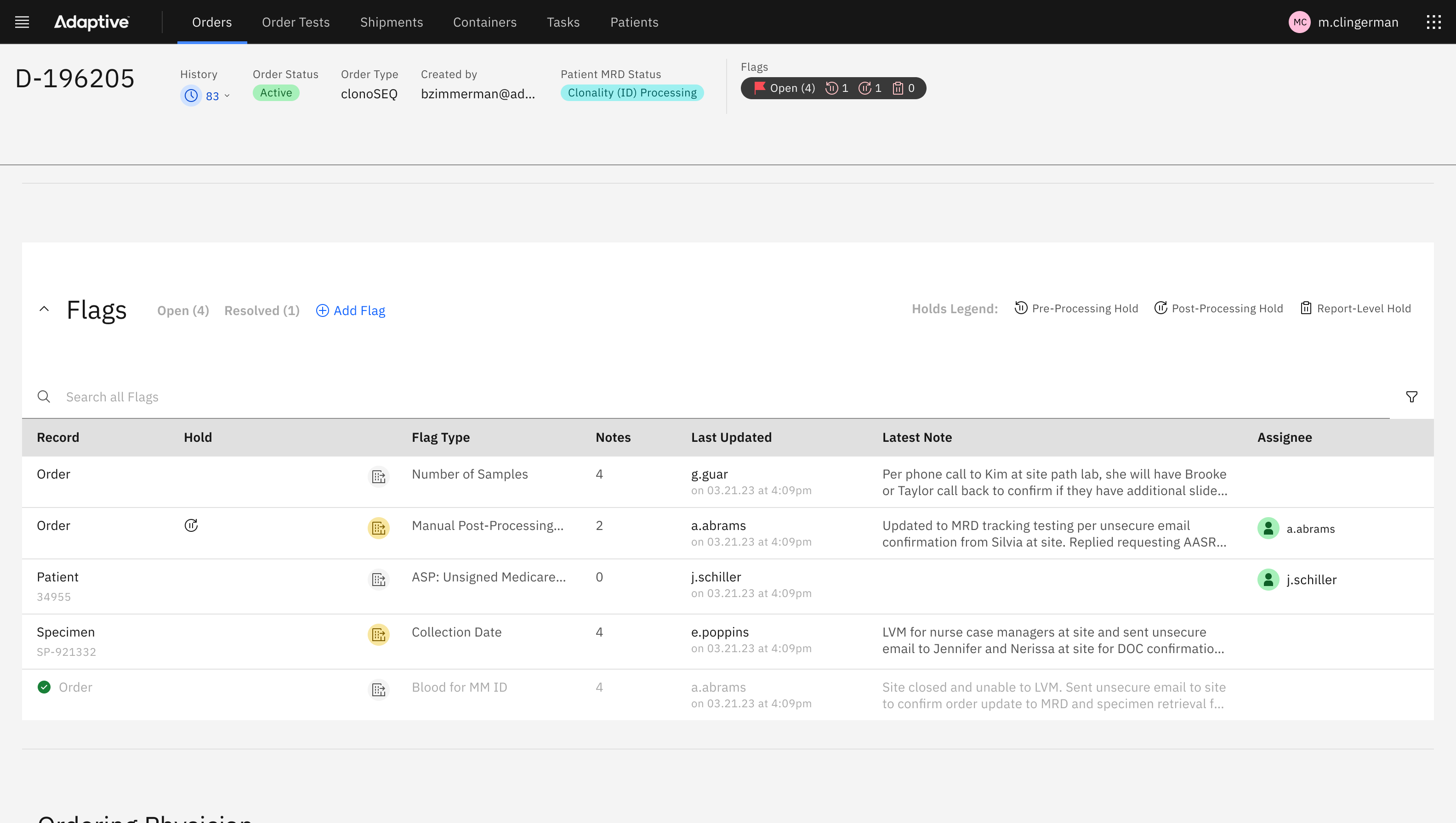
On the Order, Patient, and Subject pages, I included a Flag list (in the form of a data table, mentioned above.) Flag lists aimed to help users manage daily work by:
- Prioritizing work by surfacing it as a Flag.
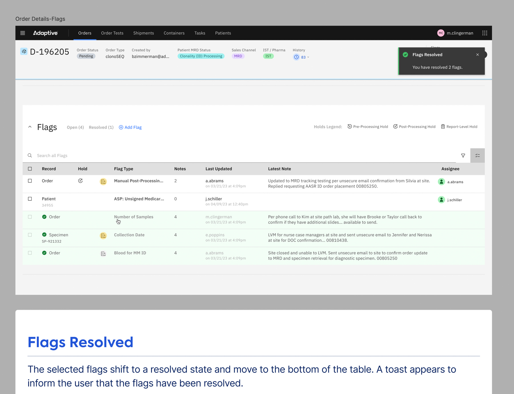
- Incorporating a right-hand Flag Panel, that could be opened beside to the Flag table, to resolve and work on individual Flags.
- Providing useful columns so that users could scan for Flags that suited their workflow in that moment.
- Providing search and filter capabilities to also identify Flags that the user is most interested in tackling.
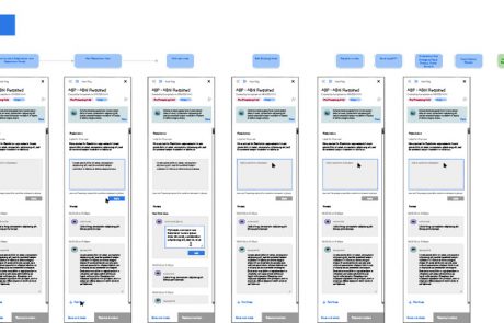
- The inclusion of arrow navigation in the Flag Panel allowed users to click through in succession and scan the contents of Flags, easing the ability to make a decision on where to dive into work resolving Flags.
The new Flags feature clarified and prioritized daily work.
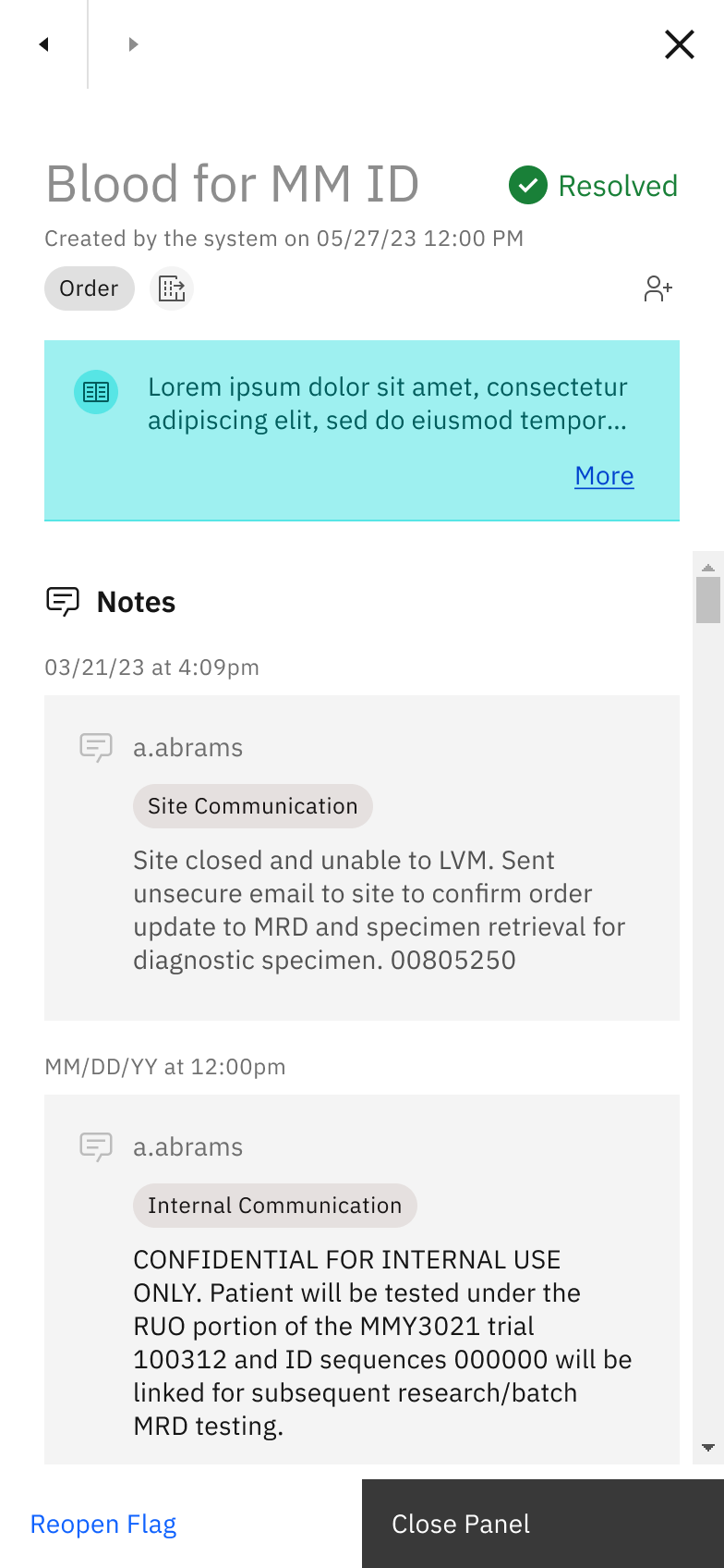

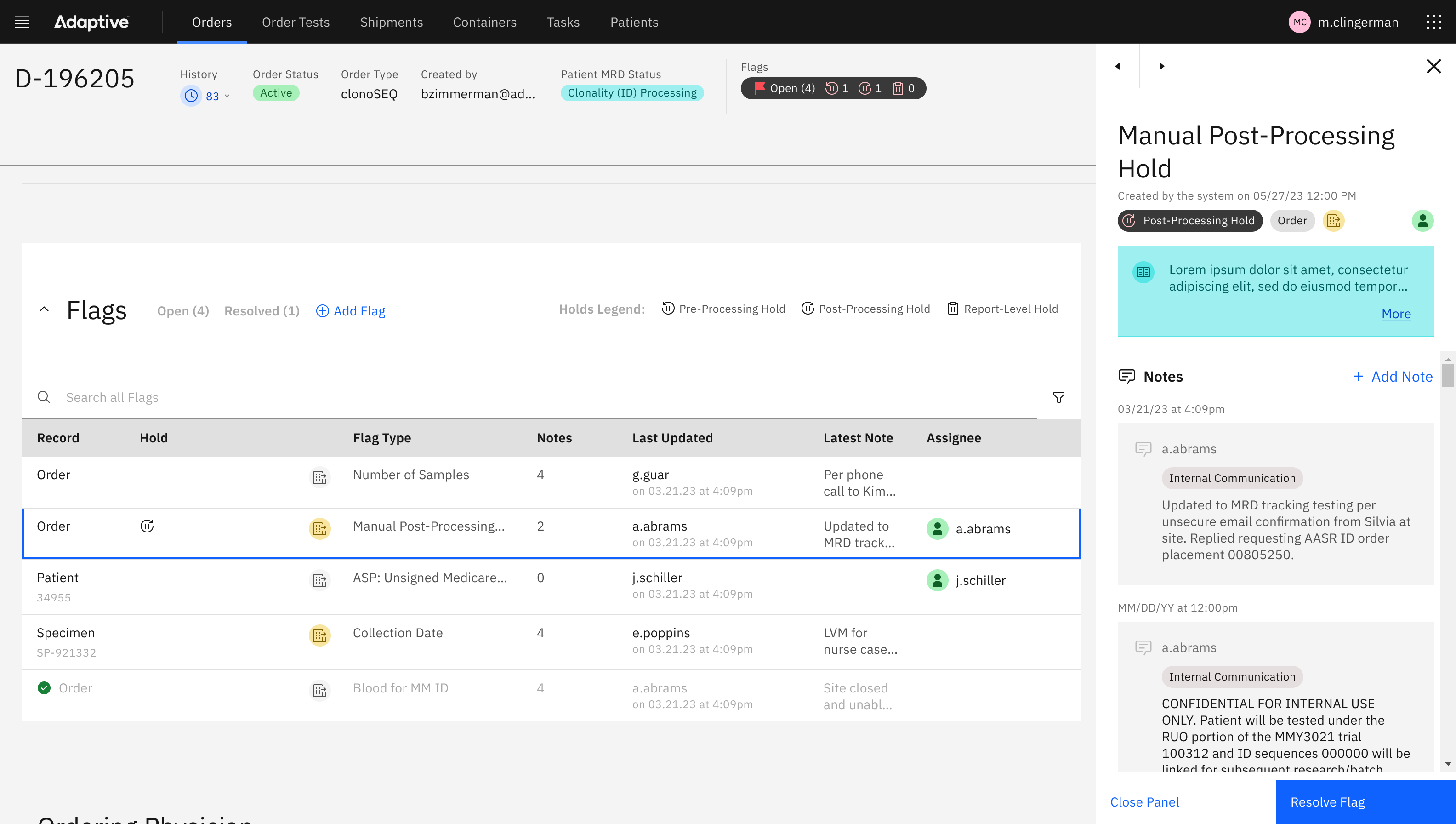

Image: the Flag panel, in this case showing the “Resolved” state, supports a clear workflow for users to resolve issues.
Flag assignment
I designed an Assignment feature, which allowed users to self-assign Flags and Reports. This feature did not “lock” an assigned record, but rather gave notice to other users who the intended owner of the Flag was. In other words, the Assignment feature still allowed other users to collaborate on the record.
Coupled with Flags, the Assignment feature was created as a way to address the struggle of managing daily work:
- A user could use the Assignment feature as a mental model to bookmark a set of Flags that were cognitively related, so that they may could those Flags as a group, applying similar problem-solving at once.
- The mental model of bookmarking similar Flags by Assigning could also be used as a way to break up work for a time period. Eg. a user could accomplish the resolution of ten similar flags in one hour, because of the fact that the work to resolve them was also similar.
- Seeing that a Flag was assigned to a different user also helped to reduce focus from Flags that had already been started on.
- Use of color in our assignment icon (green) helped as a recognizable visual anchor that was repeated across screens.
Solution C
Lack of analytics insights
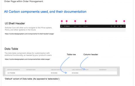
The IBM Carbon Design System has been instrumental in addressing the lack of dashboarding and analytics. Known for its robust suite of tools, Carbon enables teams to:
- Integrate well-defined design and development standards, crucial for efficiently presenting complex data.
- Facilitate a quick grasp of application functionalities derive meaningful insights, with the use of graphs and charts.
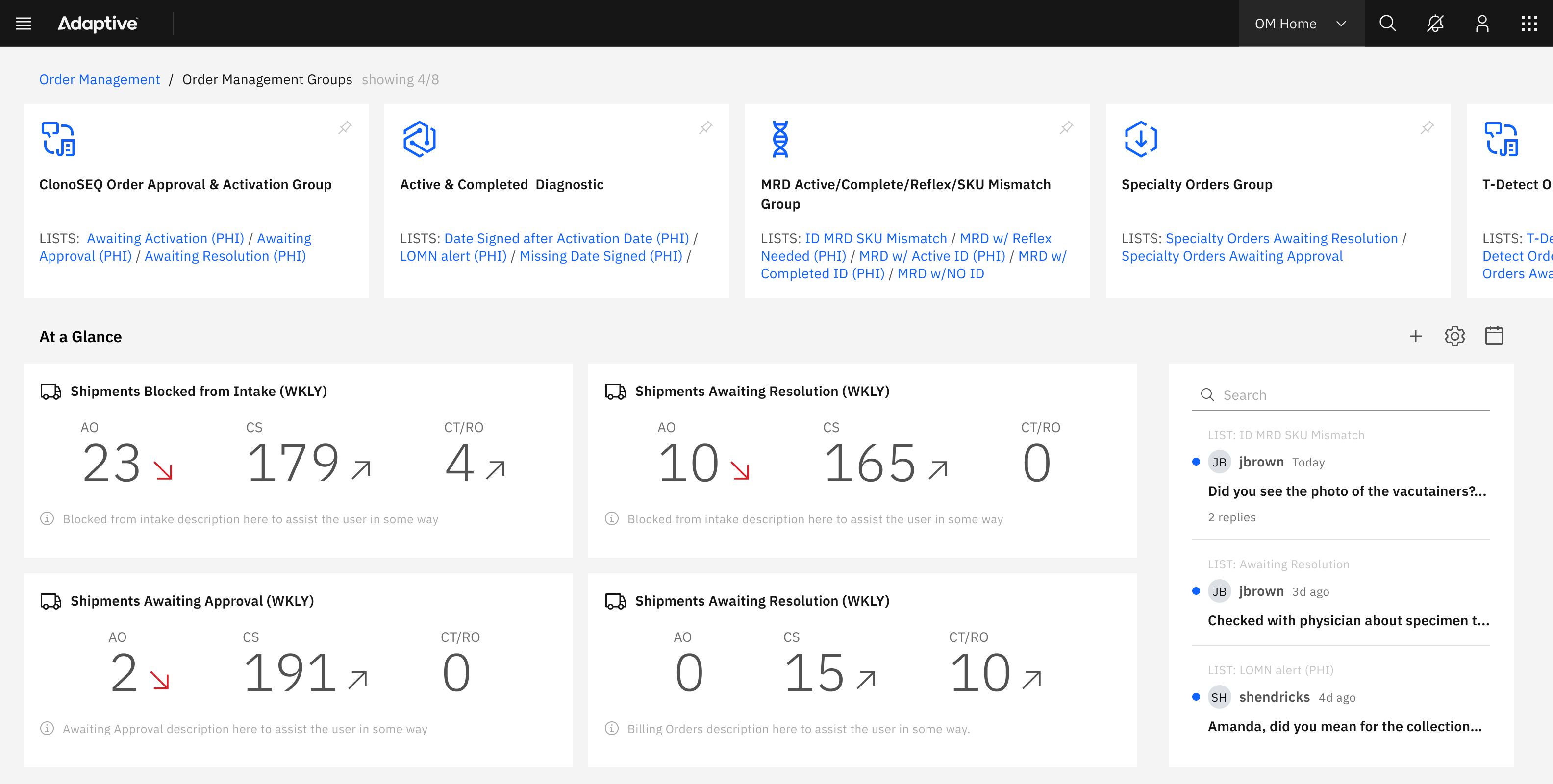
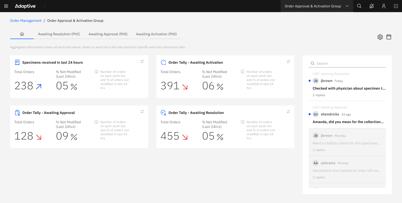
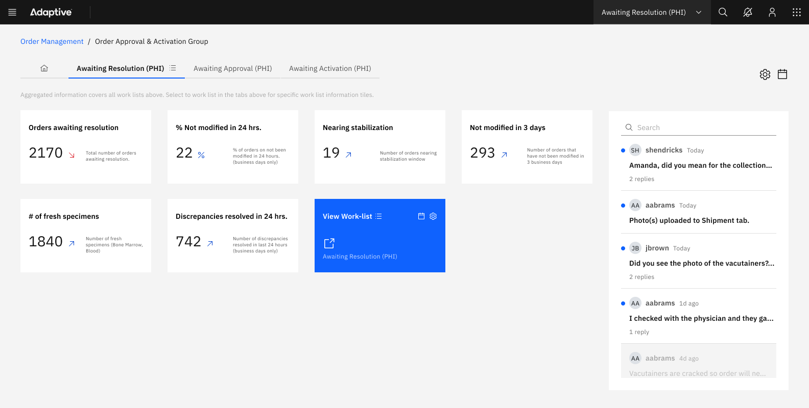
Data visualization for Worklists
During the initial phases of the project, the UX team undertook a design exercise focused on providing deep insights into the multifaceted layers of business operations. We introduced “insight tiles,” which employed a revised information architectural schema. This design was intended to address the various states of Workflows for clinical diagnostics, batch research orders, and their readiness, along with flagged alerts or discrepancies.
These workflows were categorized within different worklists, each queryable for unique purposes along the journey, such as:
- Total number of orders awaiting resolution
- Percentage of orders on the worklist unmodified in the last 24 hours
- Number of orders nearing stabilization
- Number of orders potentially unmodified in 3 days
- Number of MRD-enabled patient orders
- Number of fresh specimens (e.g., bone marrow, blood)
From a user journey perspective, the system was designed to offer users multiple levels of insight as they begin their workday, helping them either commence new tasks or continue from where they left off.
This is particularly useful in laboratory settings where sample processing occurs overnight, and data such as assignments and numbers may shift significantly.
Future improvements: Smart Tiles
Looking ahead, the UX team is exploring the potential of “smart tiles.”
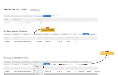
This innovative concept would allow users of the order management system to perform custom queries against specific views, providing even deeper and more nuanced insights into the orders and clinical trials data. Users would be able to create smart tiles based on specific columns of interest within the custom queries, with the added functionality of saving and sharing these custom views. This capability would offer enhanced reporting tools for leadership, facilitating better decision-making and strategic planning.
Conclusion
The comprehensive overhaul of Adaptive Biotechnologies’ Order Management System (OMS) marks a significant leap in the company’s dedication to enhancing technological infrastructure and operational efficiency. The transition from the outdated OMS and LIMs systems to the robust and versatile new OMS has significantly improved the user experience for customer-facing teams.
