Project Description
Web App Map UX/UI
VirusIQ
I volunteered for this web app design project, collaborating with a handful of other designers. The role I played is outlined below.
UX Design.
Empowering patients to get COVID-19 tests and vaccines by interacting with a map.
PROBLEM
People around the world are seeking COVID-19 diagnostic tests and vaccines. They’re finding cluttered information on the web and furthermore, much of the digital information does not display location-based, or even real-time availability.
SOLUTION
By uniting laboratories, medical providers, patients and public health agencies on the same centralized, secure digital platform, data can be shared in real-time to provide universal equitable pandemic response. The following case study shows just one persona: the patient. With the map module, they can quickly seek out both diagnostic tests and vaccines.
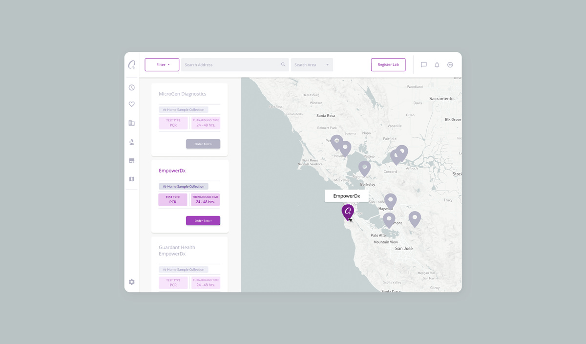
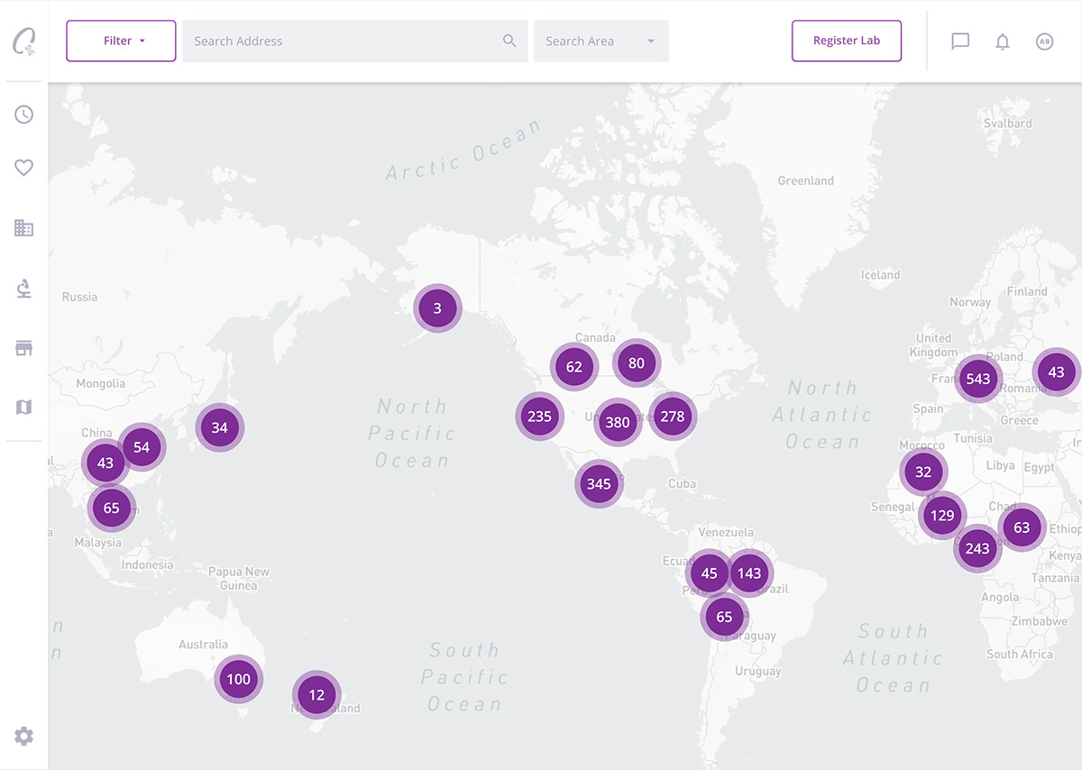
Users belonging to the “patient” persona land on the marketplace map. They can start to interact with the map, narrowing down their search from the clusters of laboratory locations shown at first.
Challenge: How do we show the robust amount of locations on a map at a given zoom level, all the while offering users control over a convoluted amount of filtering options for what laboratories are offering?
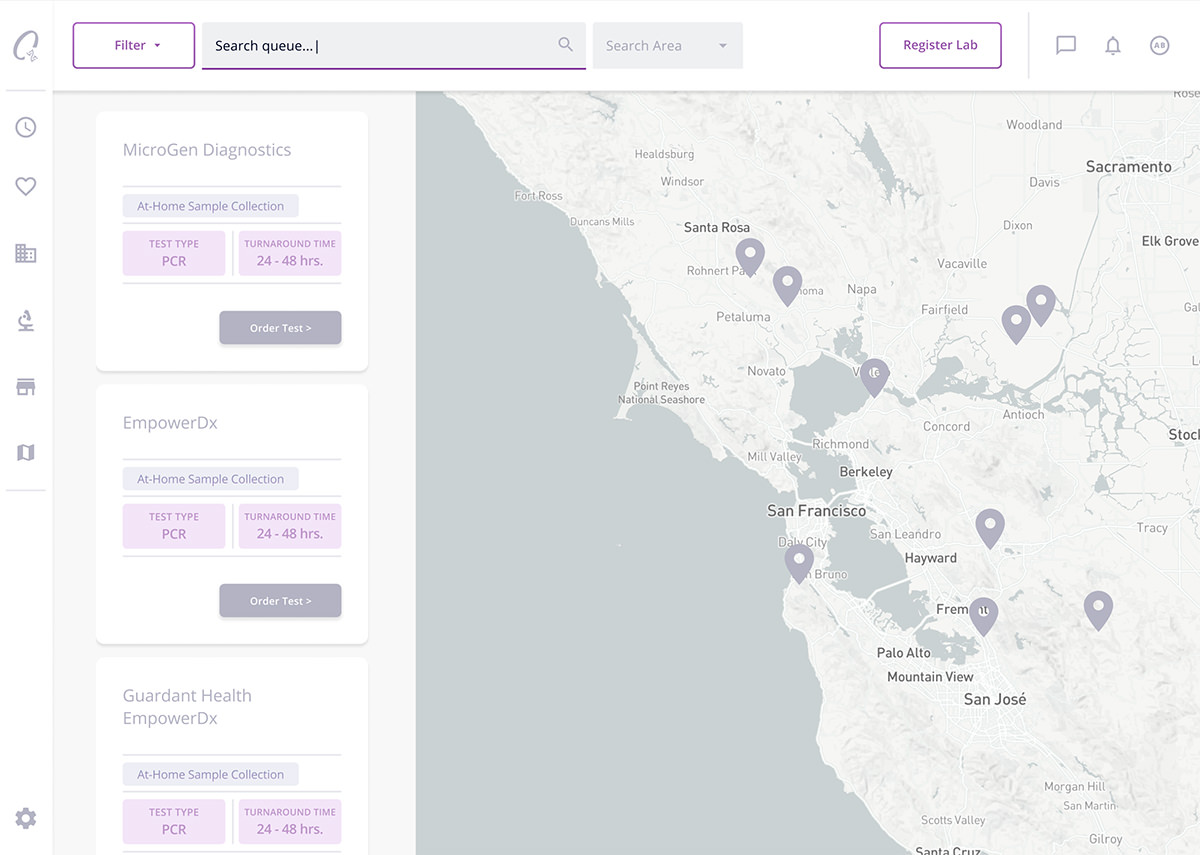
The user can begin to type their location in the search field. Lab cards in that region begin to pop-up automatically.
The user can further narrow their search by selecting a mileage range from a drop-down menu.

Now, to identify their desired test or vaccine, they begin to interact with the filter bar. The user clicks “Apply Filters” to affect the map’s results.
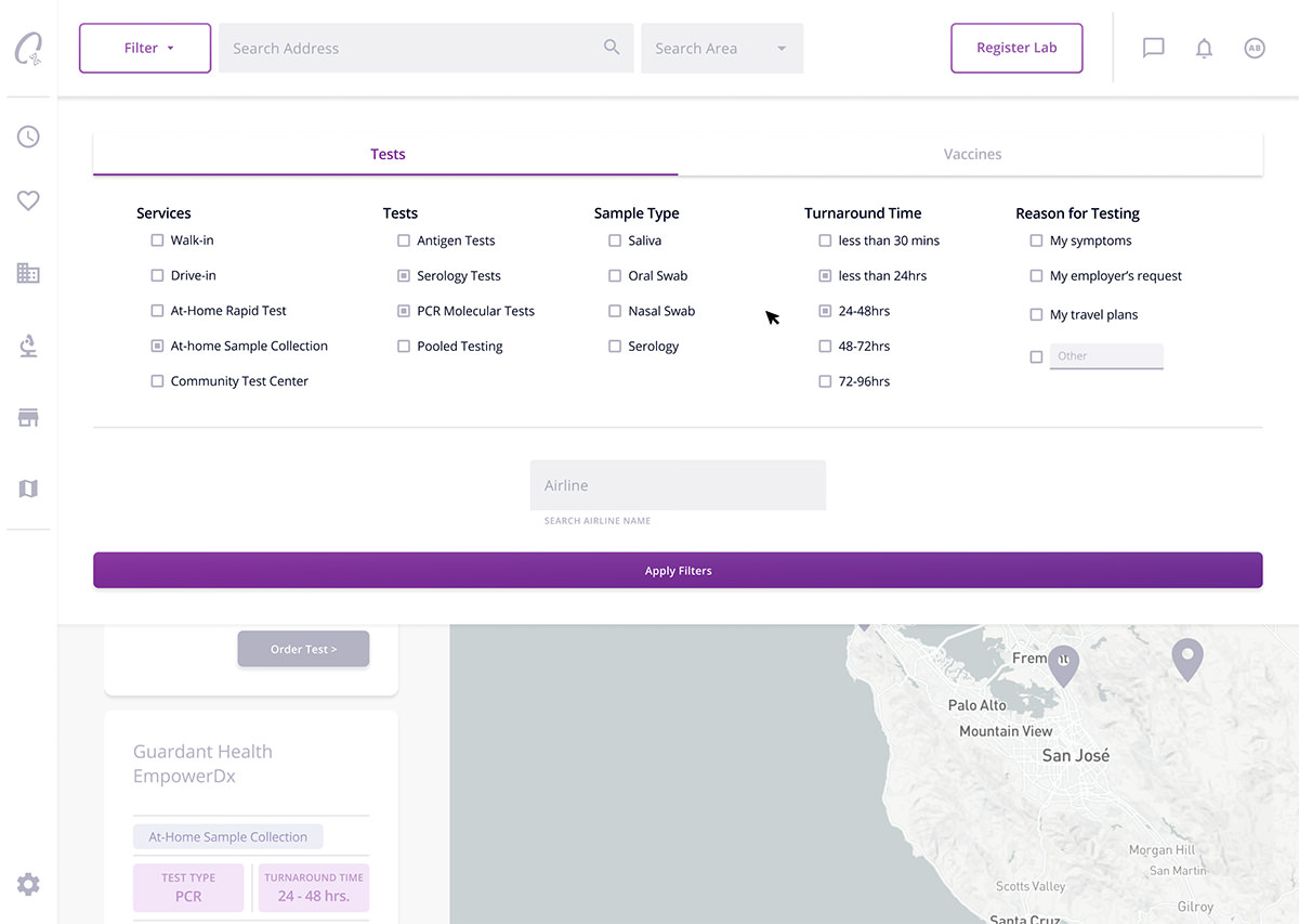
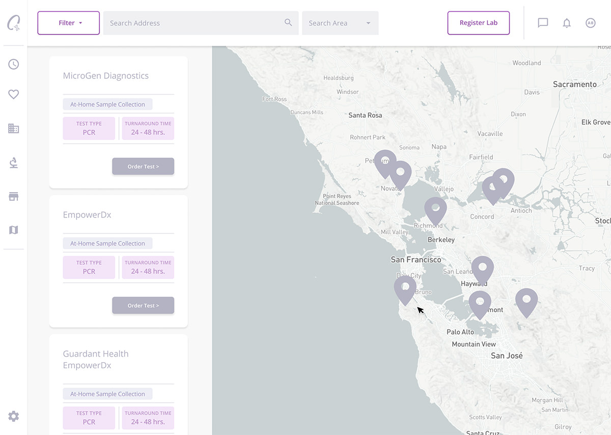
Lab card search results are narrowed and shown in a scrolling column.
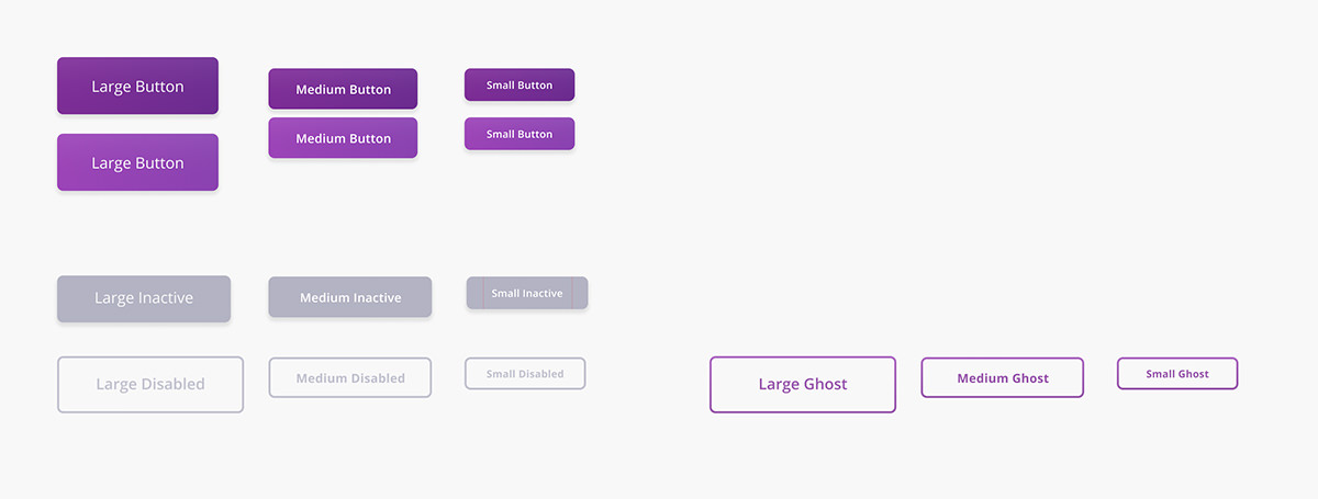
Do to the robustness of levels of onboarding for VirusIQ’s partnering laboratories across the country, various coloration and button styles are used to distinguish them.
Discovery: Allowing for a robust, full-width filter bar, we were able to allow users to refine a relevant search early on in the user-journey. For example, being able to chose a “Turnaround Time” for a test immediately defines an important nuance of the patient’s need.
For example, “Onboarded”, “Awaiting Onboarding,” and “Not Yet Onboarded” are three different states of onboarding.
The product manager at VirusIQ wanted for the lab cards to be visible to the user, even if they weren’t yet onboarded, in order to show that more and more laboratory partnerships were onboarding to the app.
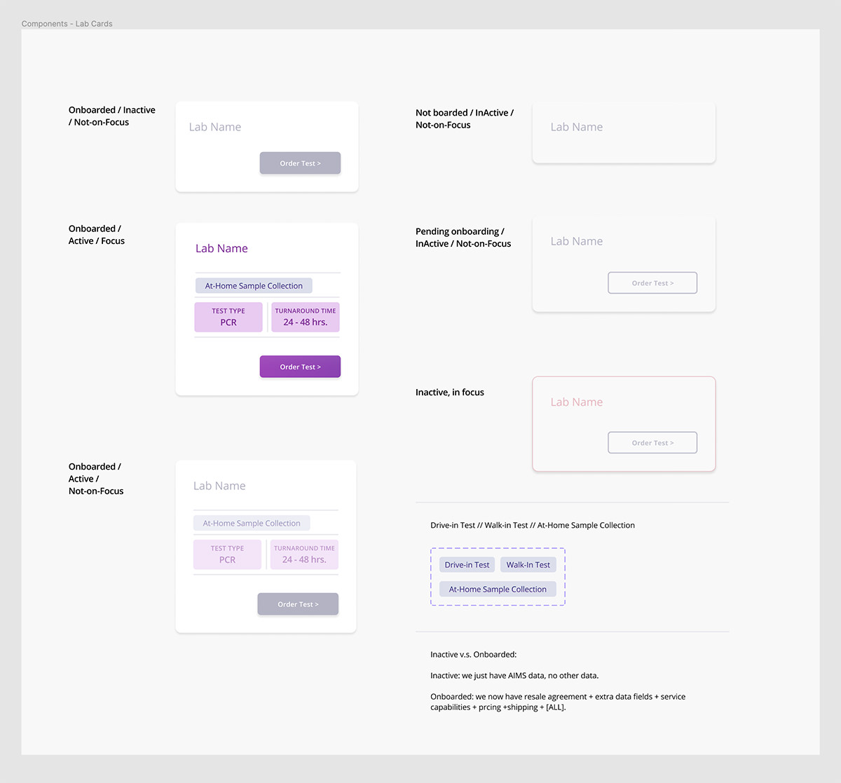
In addition to the color-states and design-styles for onboarding, the lab cards have in-focus color styles:
When the location pin is clicked on, the respective lab card is scrolled-to and changed to the in-focus color states.
Discovery: I was able to make various color and design styles work collaboratively to define active usability states (like hover, focus, etc.) with subject-matter states like “Onboarded” and “Pending Onboarding” etc.
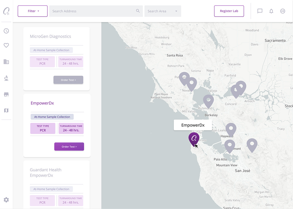
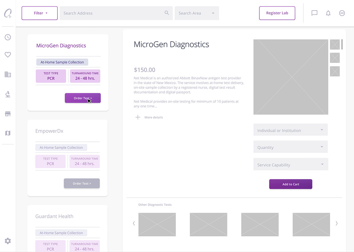
On the active lab card, the button “Order Test” allows the e-commerce module to expand.
From here, and e-commerce design pattern is followed to display at-home diagnostic test kits.
UI design.
Creating a thoughtful design system that would feel highly aesthetic and intuitive.
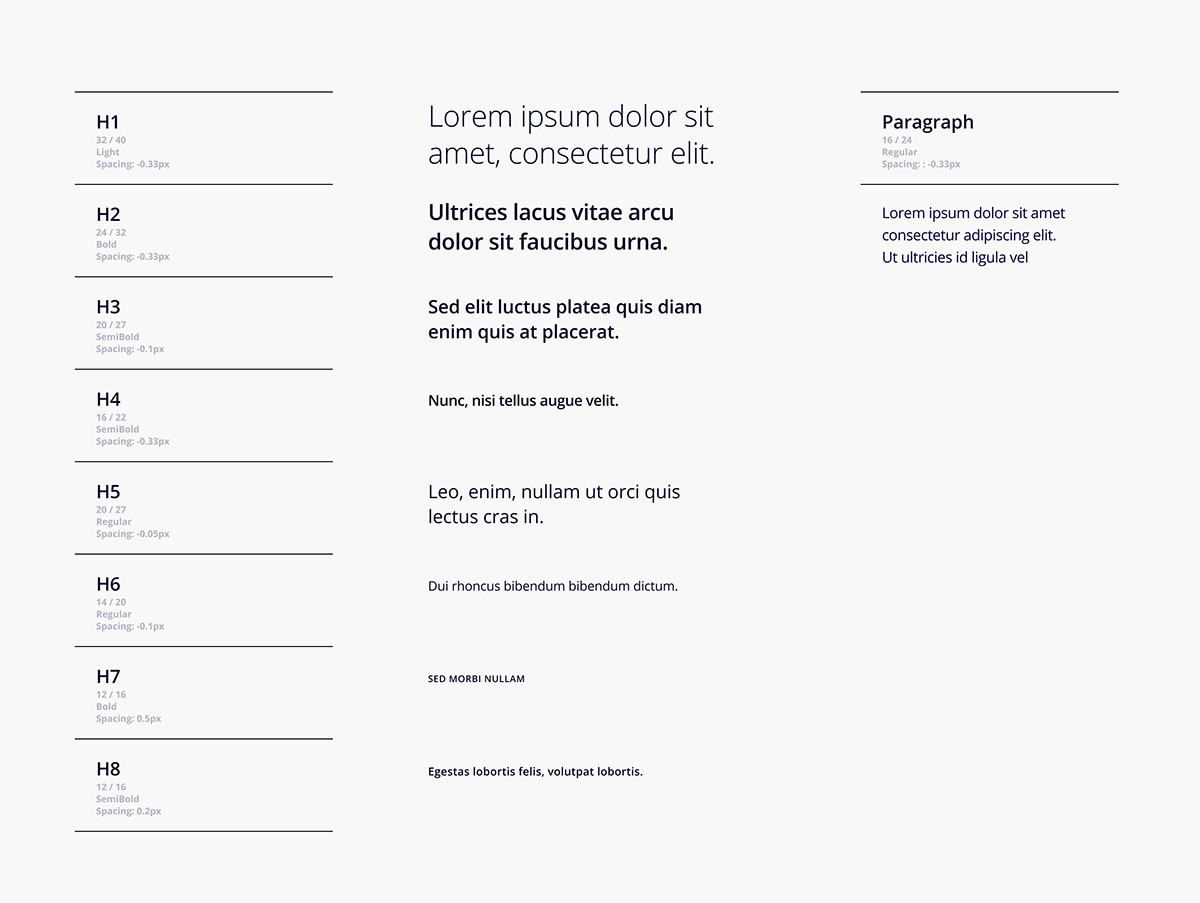
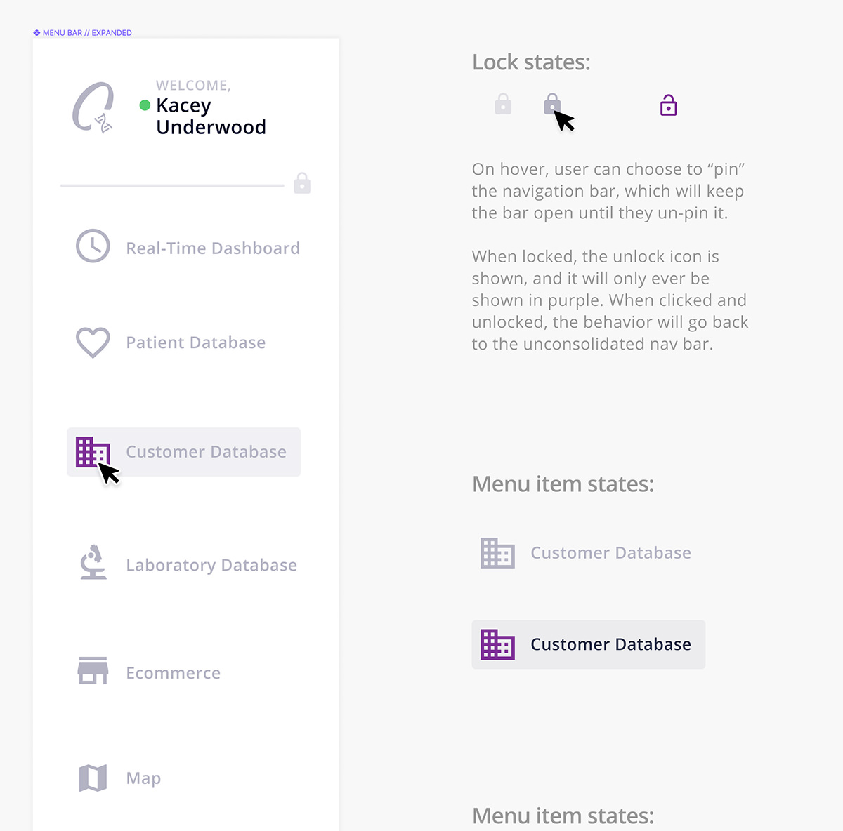
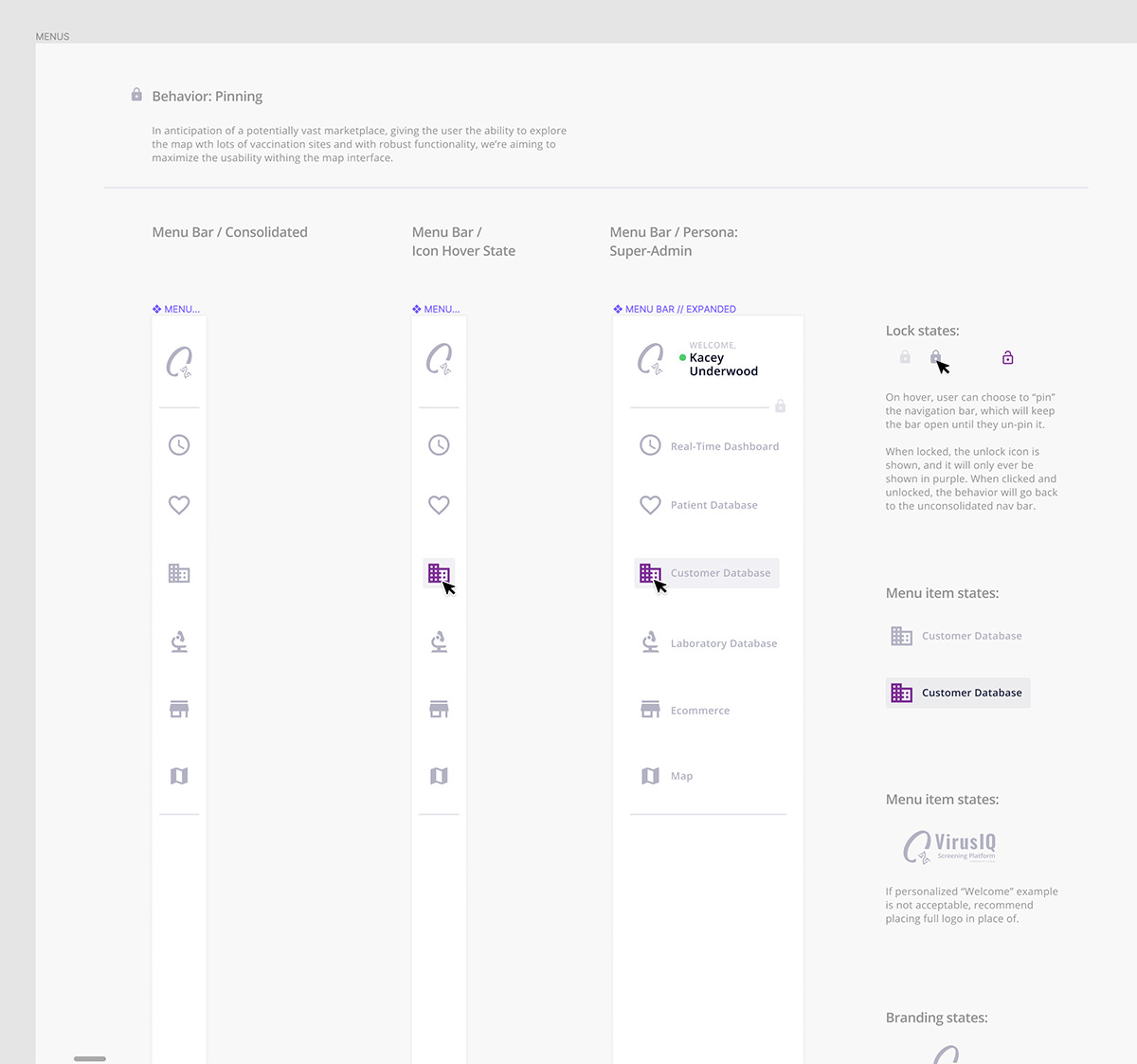
I created a robust set of text styles and components with variants to be used with the web app. I took care to clearly label the states of each component in order to communicate the functional intent to the engineers.
Lorem ipsum dolor sit amet, consectetur adipiscing elit. Duis eget egestas libero.
Thanks for looking!
I collaborated with Michael Clingerman extensively on this project. Thanks to Michael for offering helpful senior-level guidance on so many of our design decisions.
